Summary
Uprooted is a software solutions agency based in Vancouver, BC. I was approached by them to create and update their brand colours and brand logo. This project was enjoyable as one of my first clients. There was a lot of back and forth and some great feedback was given to help me refine how to approach the process.
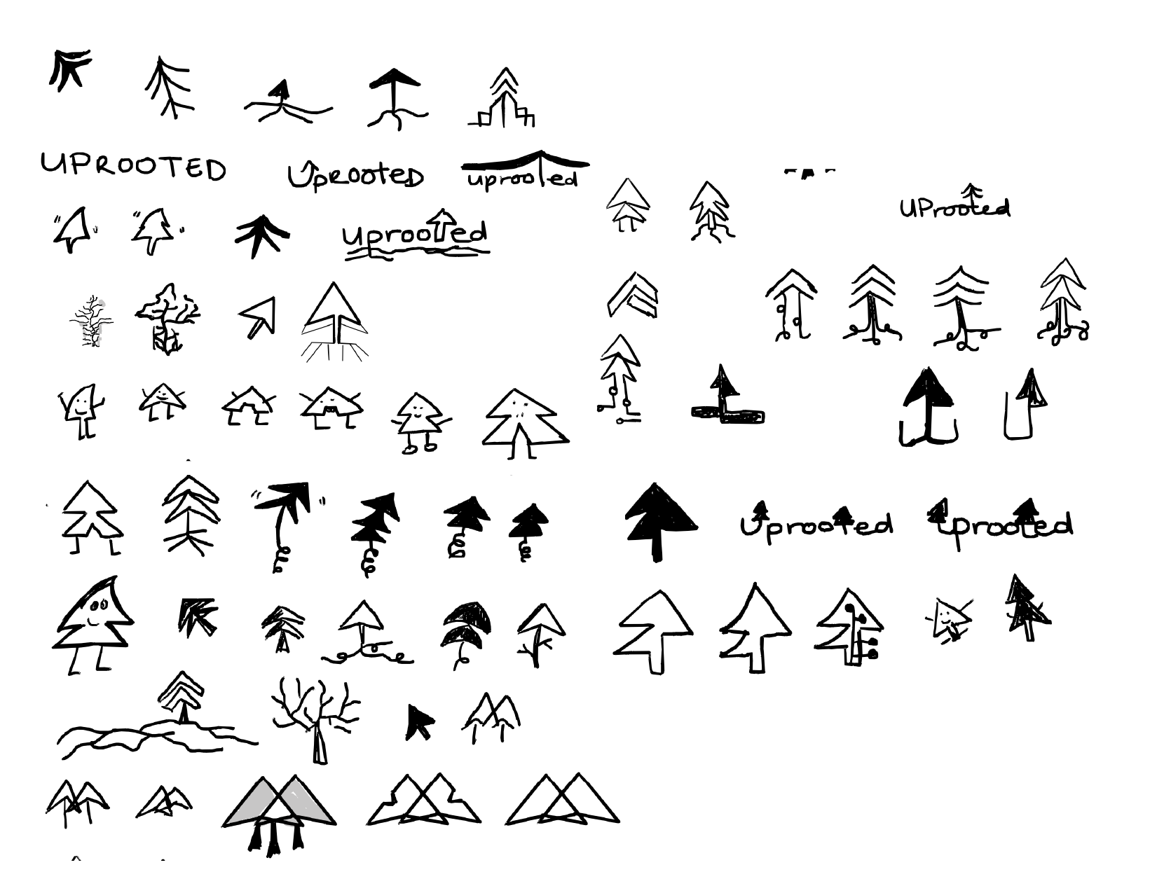
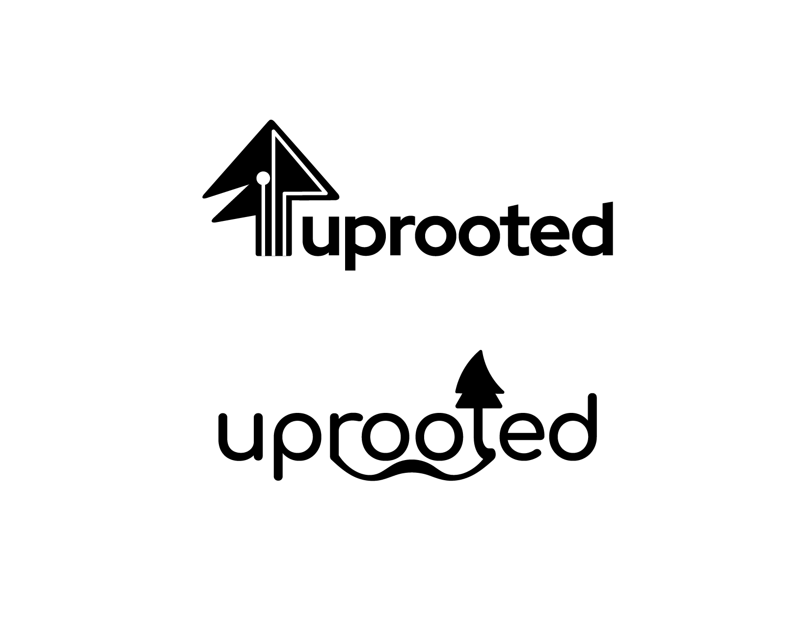
In our initial meeting, we discussed who Uprooted's target audience is, their past clients, and what kind of feeling it hopes to evoke at a glance. The key takeaways were that Uprooted wants to be portrayed as playful, caring, and diverse in ability. Uprooted is an agency that aims to offer a wide range of solutions and has demonstrated that through their many software clients in industries from gaming and education to the construction industry. They also wanted something that has the potential to be animated. I started the process by researching and sketching. To the left is Uprooted's original logo and to the right you'll see a number of initial sketches just to get myself started.
Process
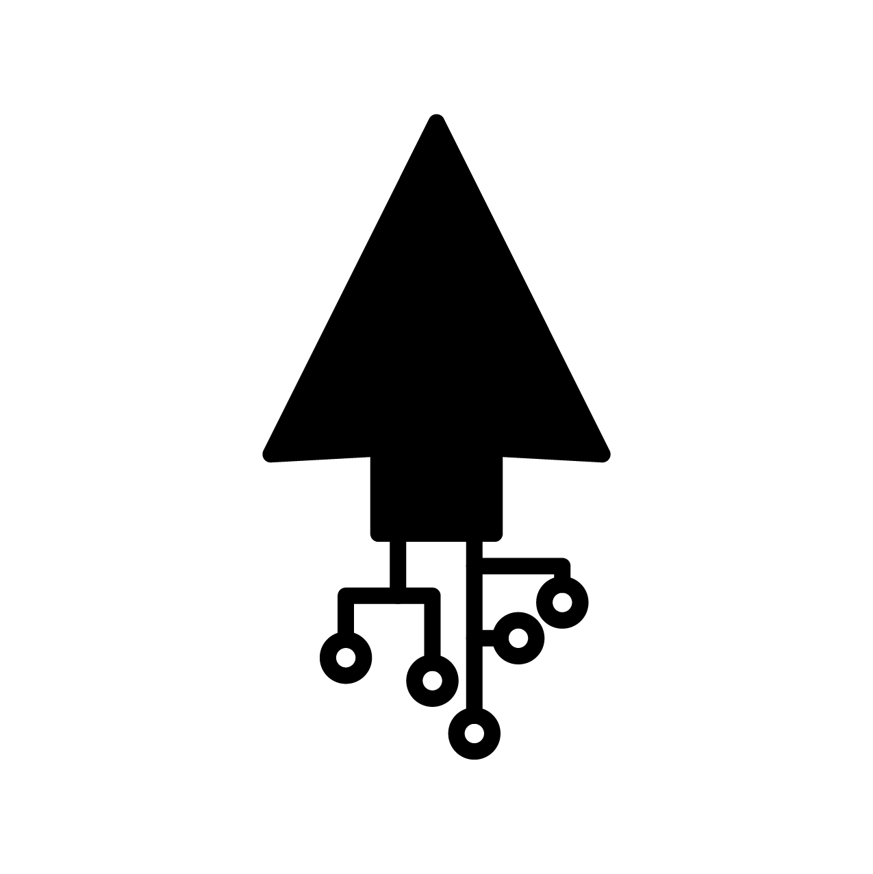
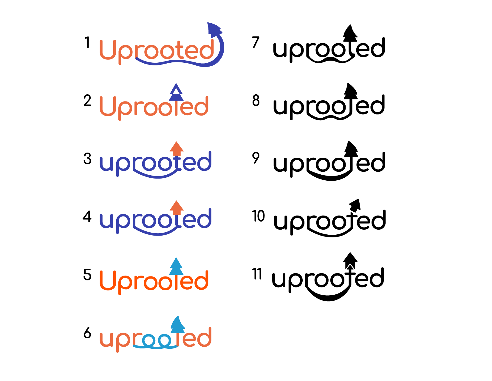
I presented two initial drafts. The first aimed to present Uprooted as a software company, while also playing off of the company's old logo. I wanted to use a typeface that showed competence. The lines in the arrow were to represent a technical switchboard but the entire composition felt a little too cold.
The second option I presented to the right below was meant to take a more playful tone. The roots in linking the "R" to the "T" are a link between software and the human, natural aspect of software development. This one, though not quite what they were looking for resonated more with Uprooted, so we continued to iterate from here.
Iterations, Colours, & Font
Following the initial sketches came logo iterations. With direction from Uprooted, I began developing the idea of the roots connecting the "R" and "T". I also started playing around with colour, as I felt the design needed more life when presenting to the client. Uprooted wanting to present itself as playful and adaptable led me to choose orange for its approachability and friendliness, with a blue accent for dependability and trustworthiness. We began seeing faces in the logo iterations and we wanted to continue in that direction, which ultimately led to the final logo.
We ended up choosing a tomato red-orange colour with a lighter blue because we wanted to encourage friendliness and reliability. The combination of these two colours creates a nice contrast that complement each other in a bright but non-aggressive way.
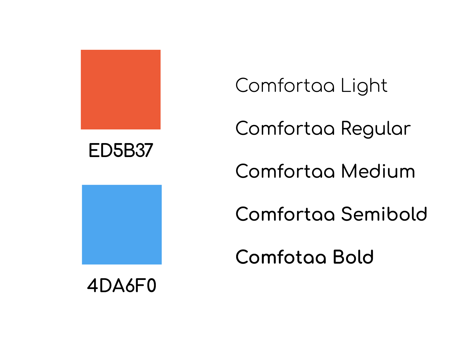
We chose Comfortaa for the primary typeface. It is a geometric and rounded sans that is approachable and legible. It provides a comfortable look and can be placed among credits for any software work Uprooted does in the future. Comfortaa is now being used in Uprooted's webiste headings and logo wordmark.
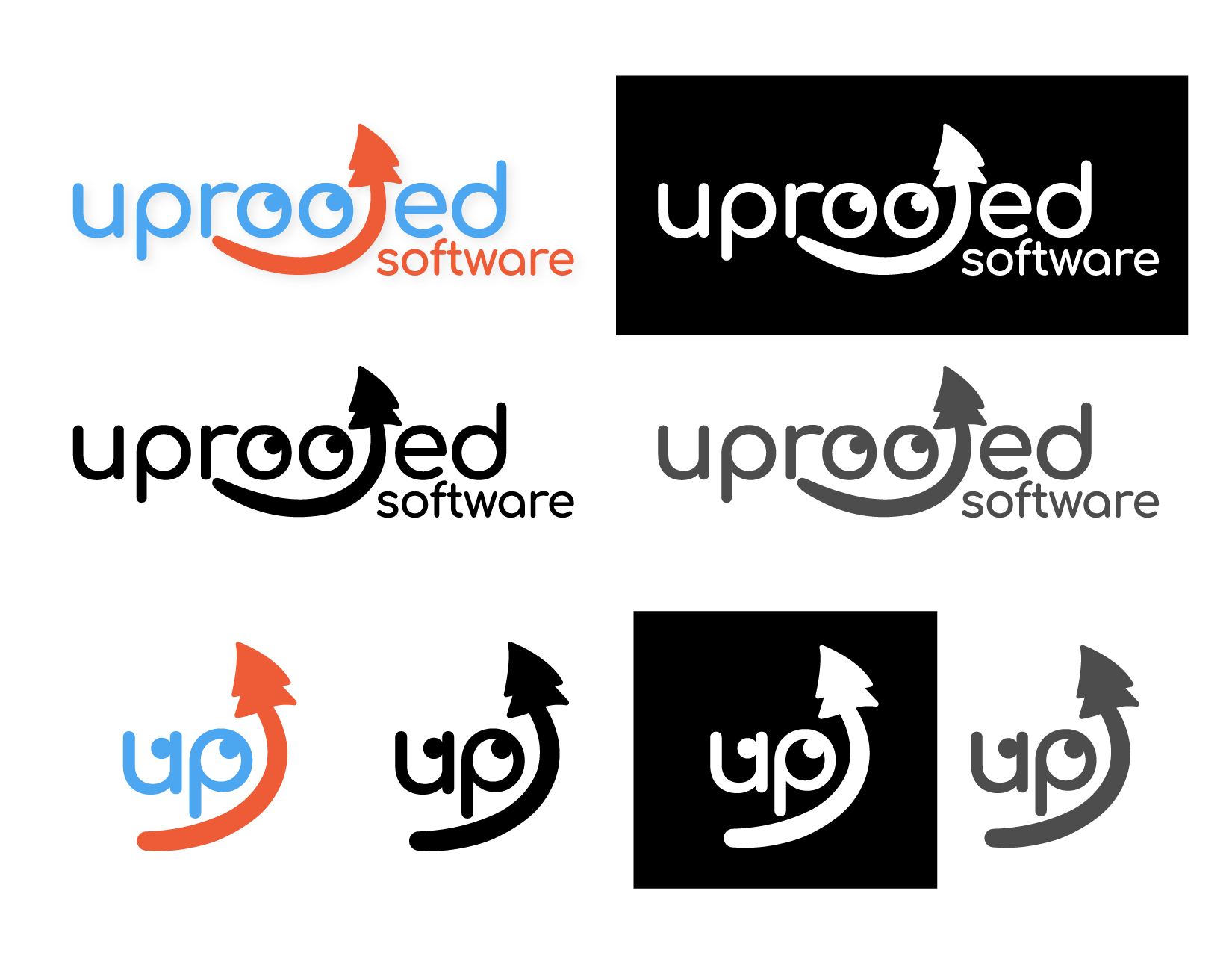
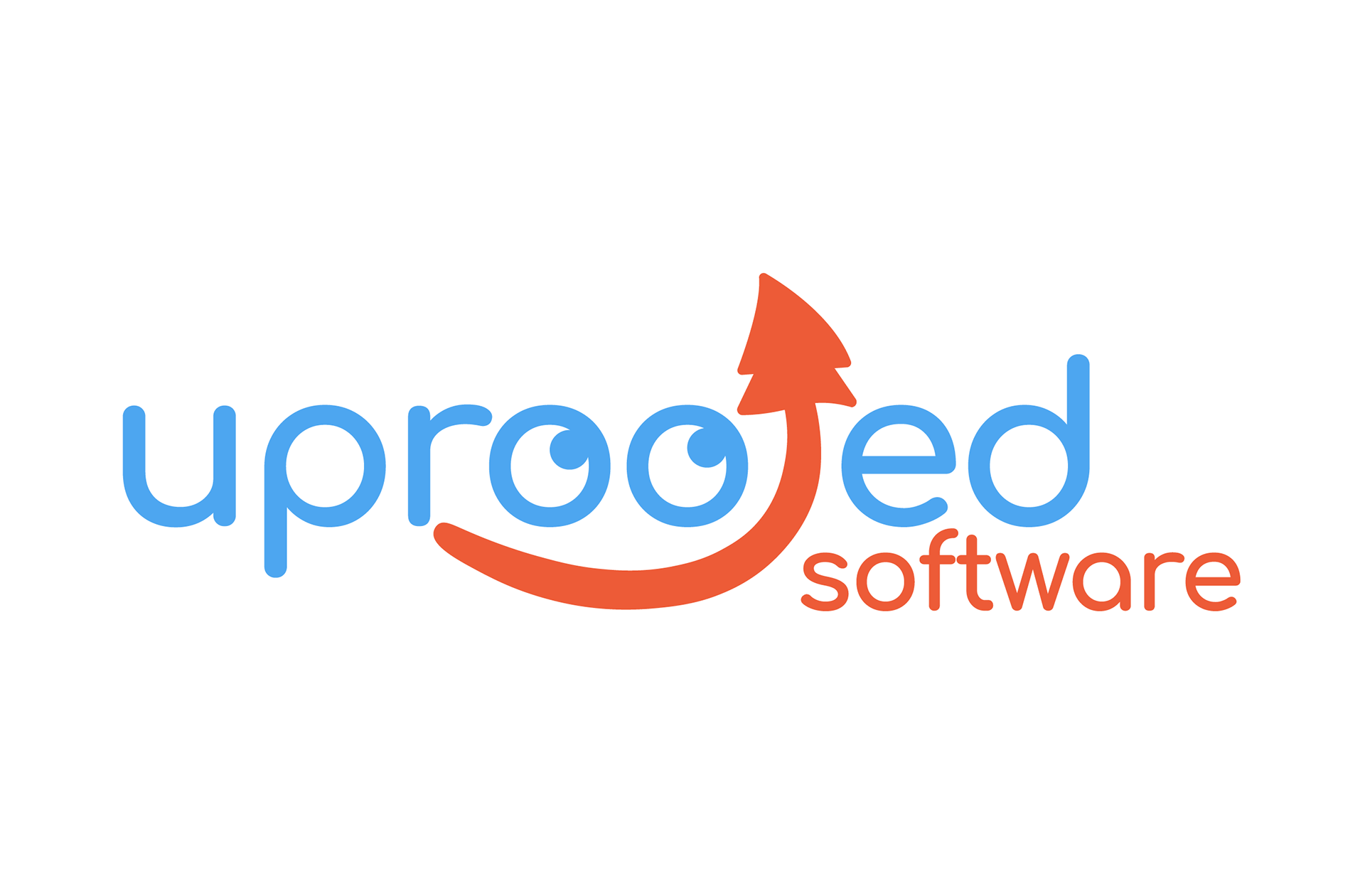
Final Logos and Favicons
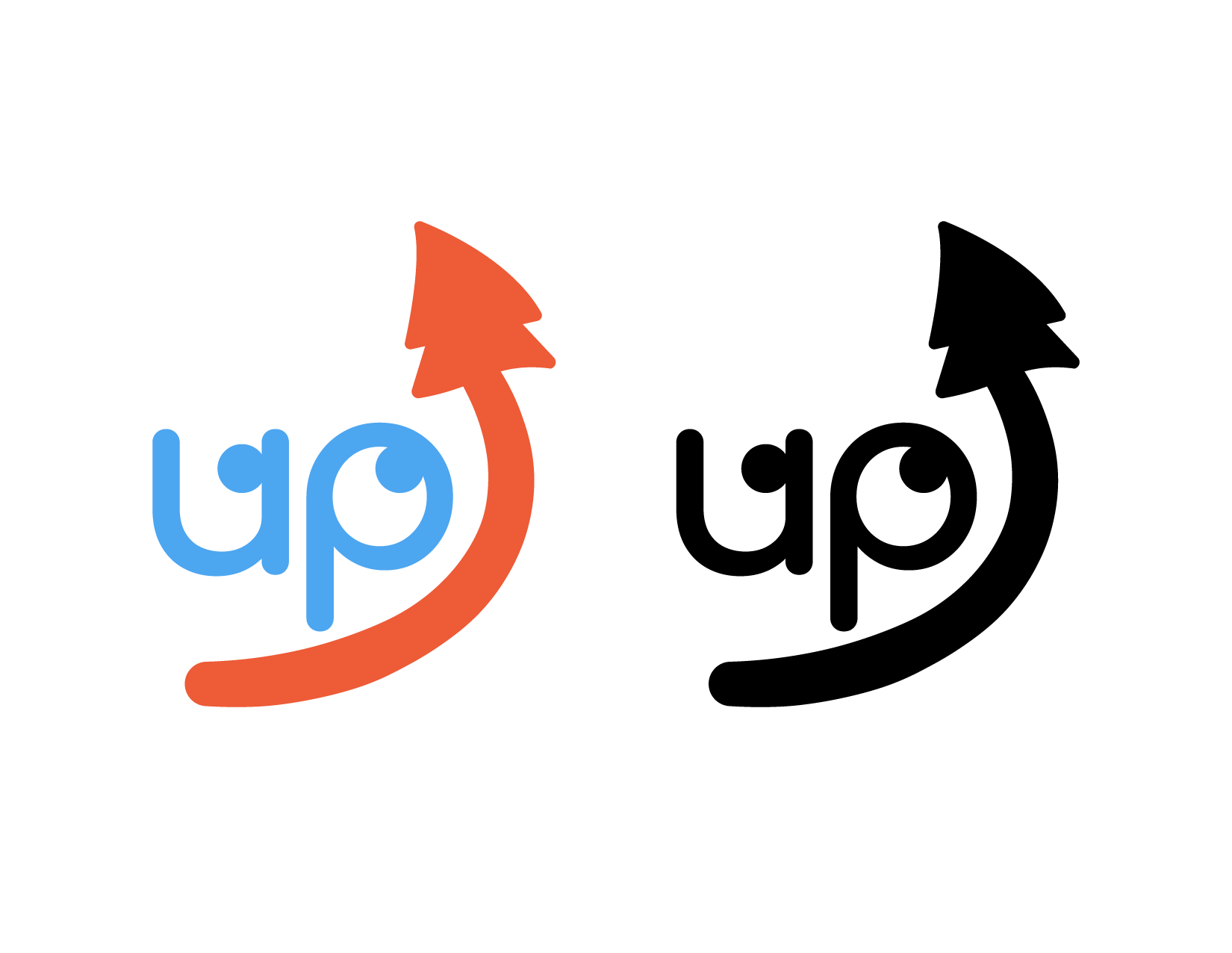
I wanted to keep the recognizable face from the full logomark in the favicon. It clearly says Up for Uprooted and features the rooted tree going upward with the same cheeky smile looking towards it. These favicons will be seen in any social media profiles or posts made by Uprooted, so I wanted it to be very clear that they are part of the same package.
Here you see all of the final logos and their favicons. As you can see, we ended up disconnecting the "R" and the rooted "T" for symbolism. The tree is going in an upward direction and needs not be tied down. Though it is still closely related, it has more freedom this way and feels more playful. This project was quite fun and I'm thankful to Uprooted to have given me the opportunity to work on such a playful logo with them. As I continue finding my footing, I quite enjoy having the ability to test the waters in various industries. This is my first software logo and I am satisfied with how it turned out. This project opened the door to working with clients and I am glad to have had the chance to learn through practice.