
Summary
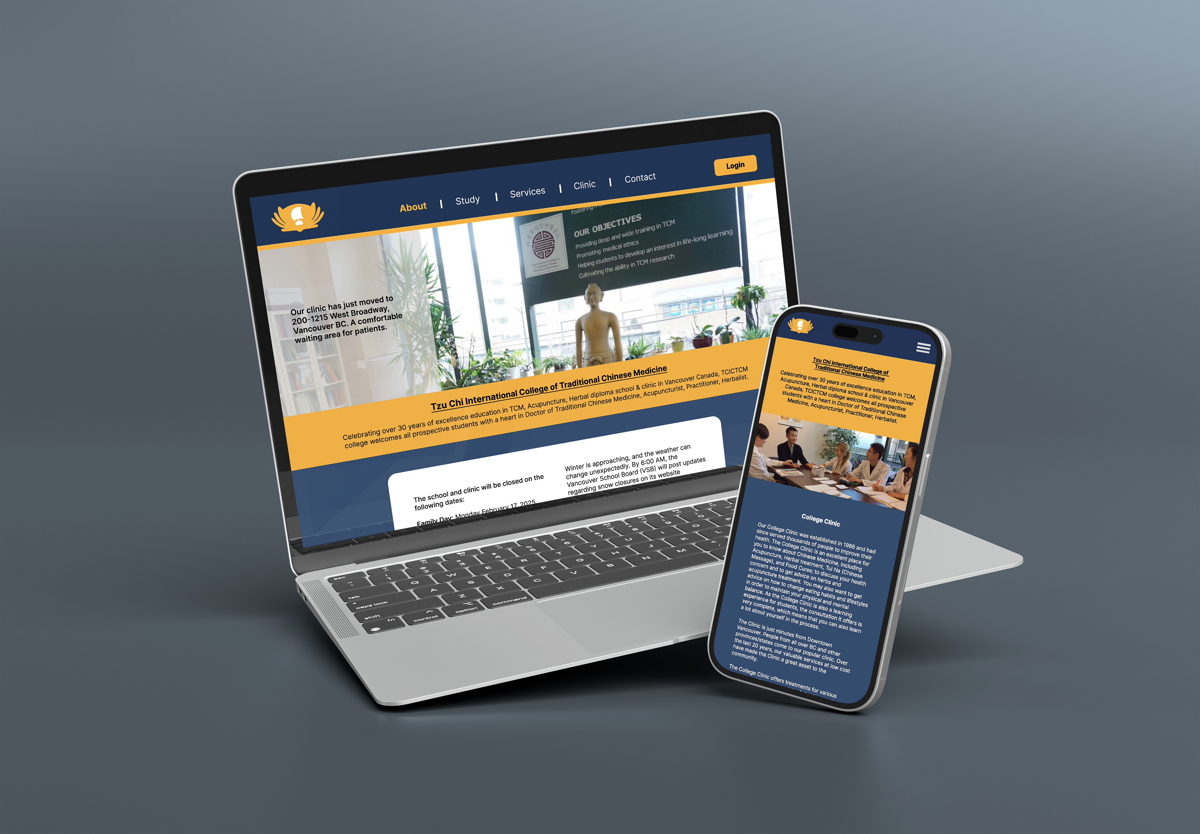
The Tzu Chi International College of Traditional Chinese Medicine design study takes a modern avenue to this Vancouver, Canada-based institution. I worked on this web redesign to explore a contemporary web approach within an existing brand's constraints and demonstrate my ability to take the content and redesign it for more optimal navigation and user experience. This project reflects a responsive redesign for mobile and web platforms and was completed using Figma and Adobe Illustrator.
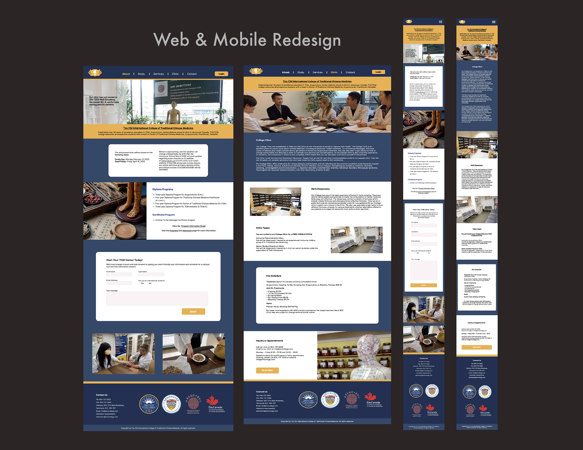
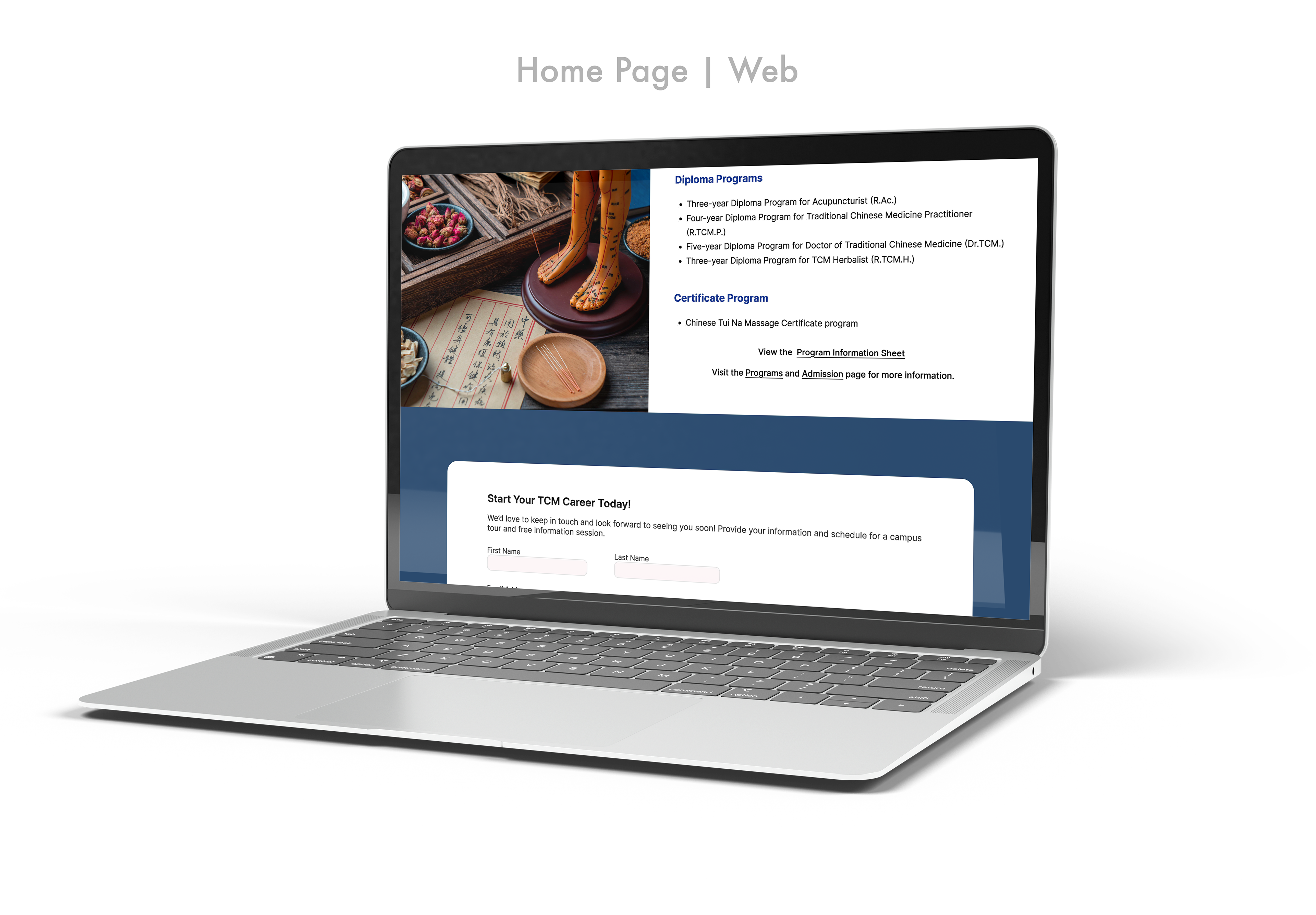
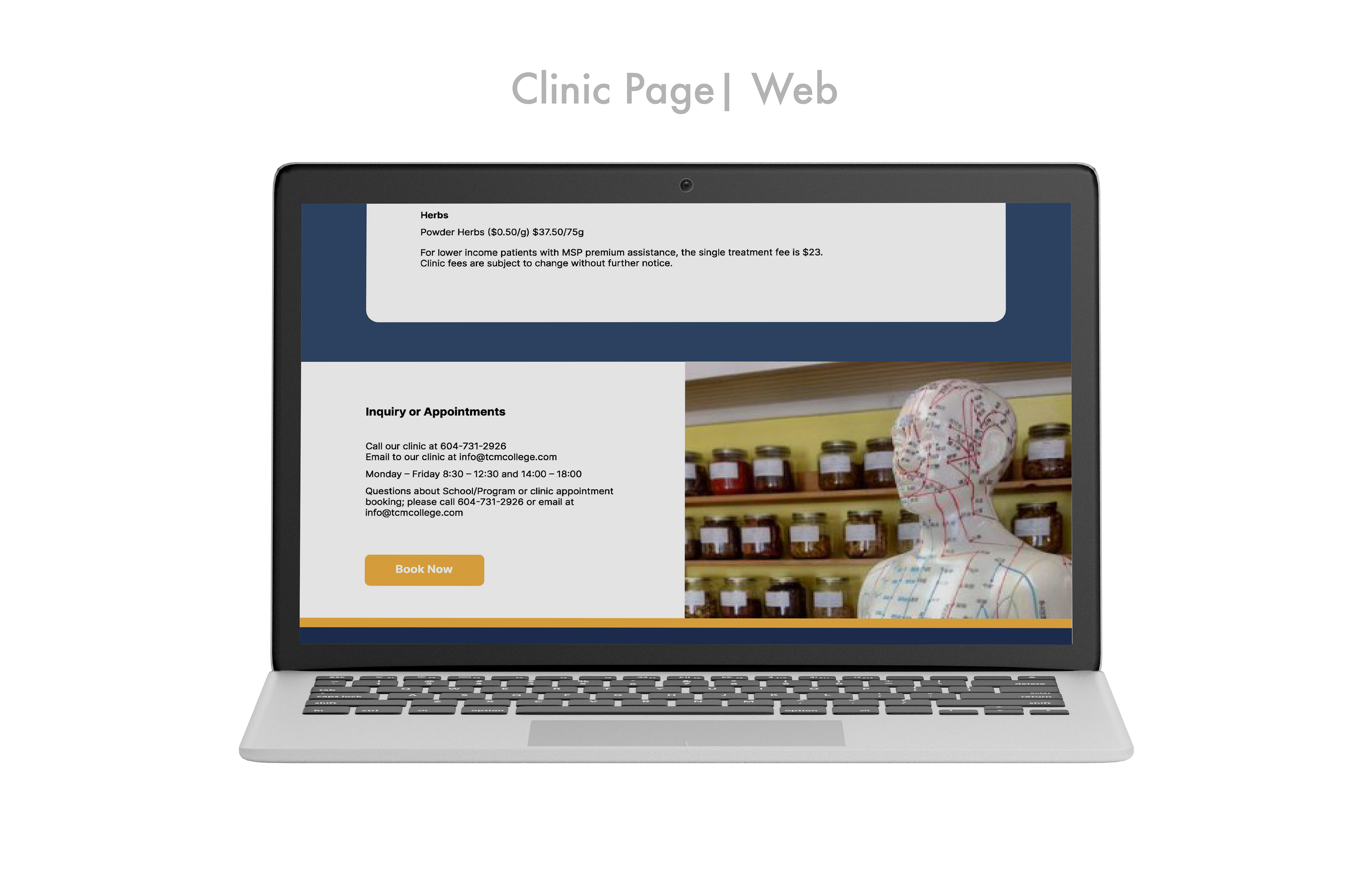
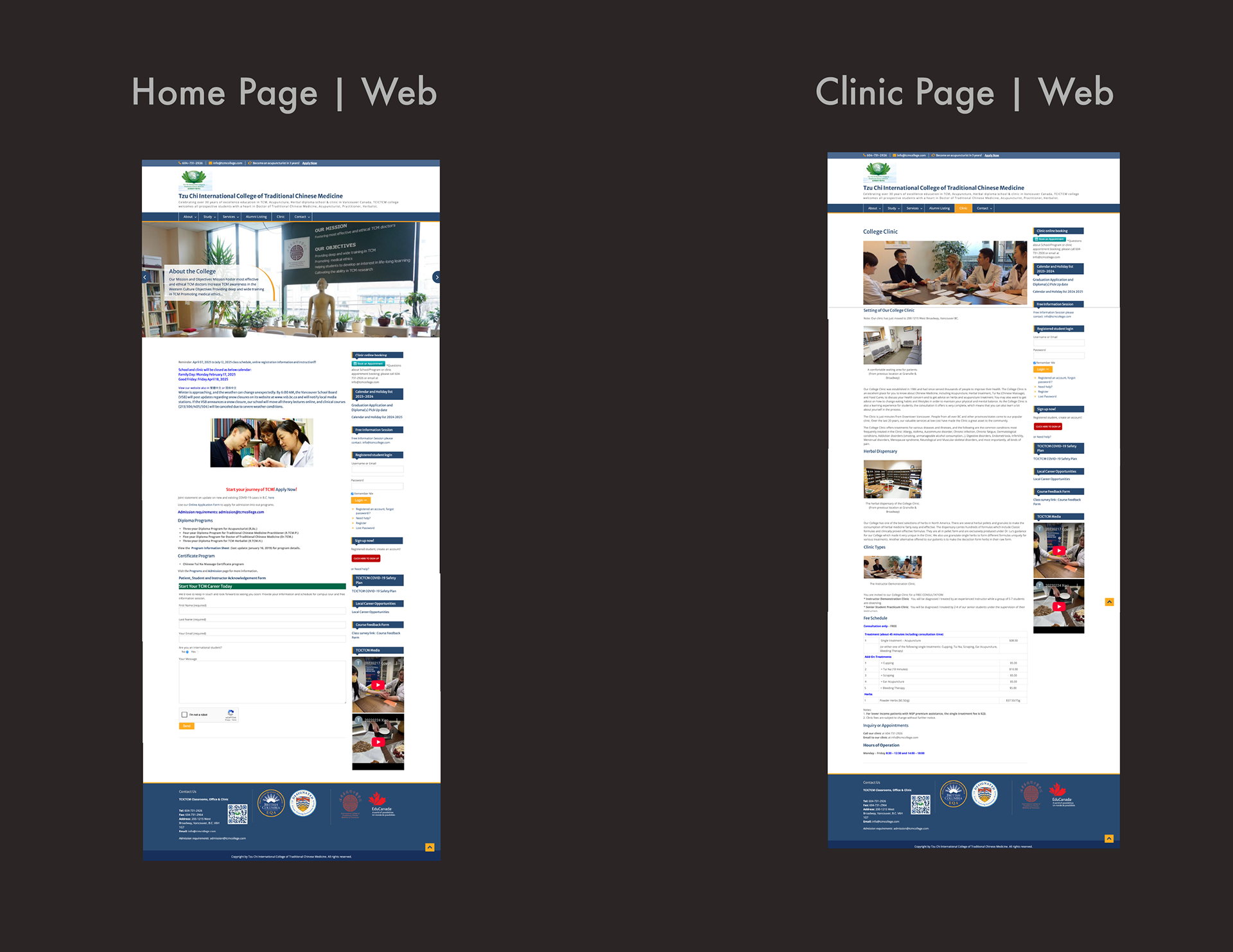
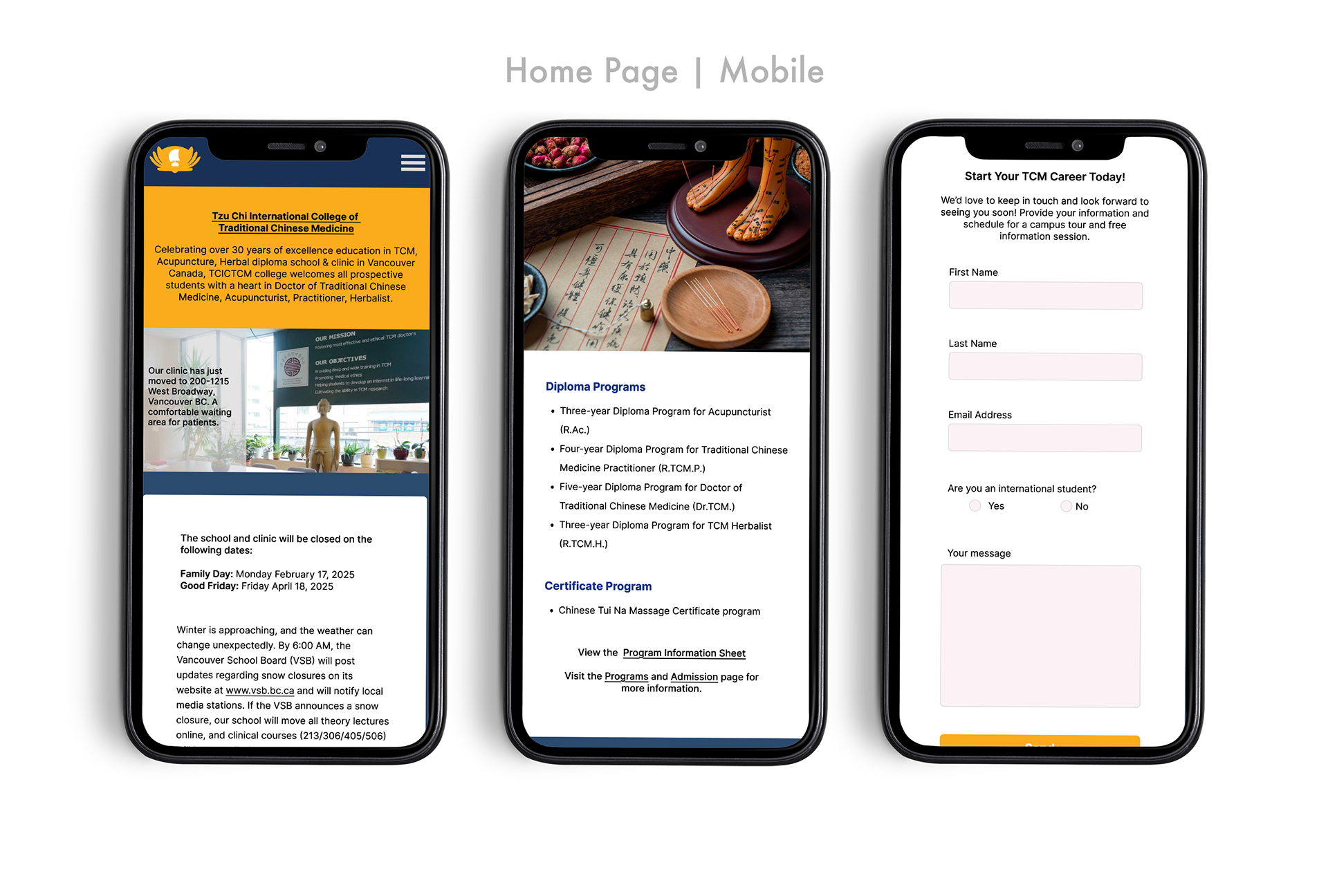
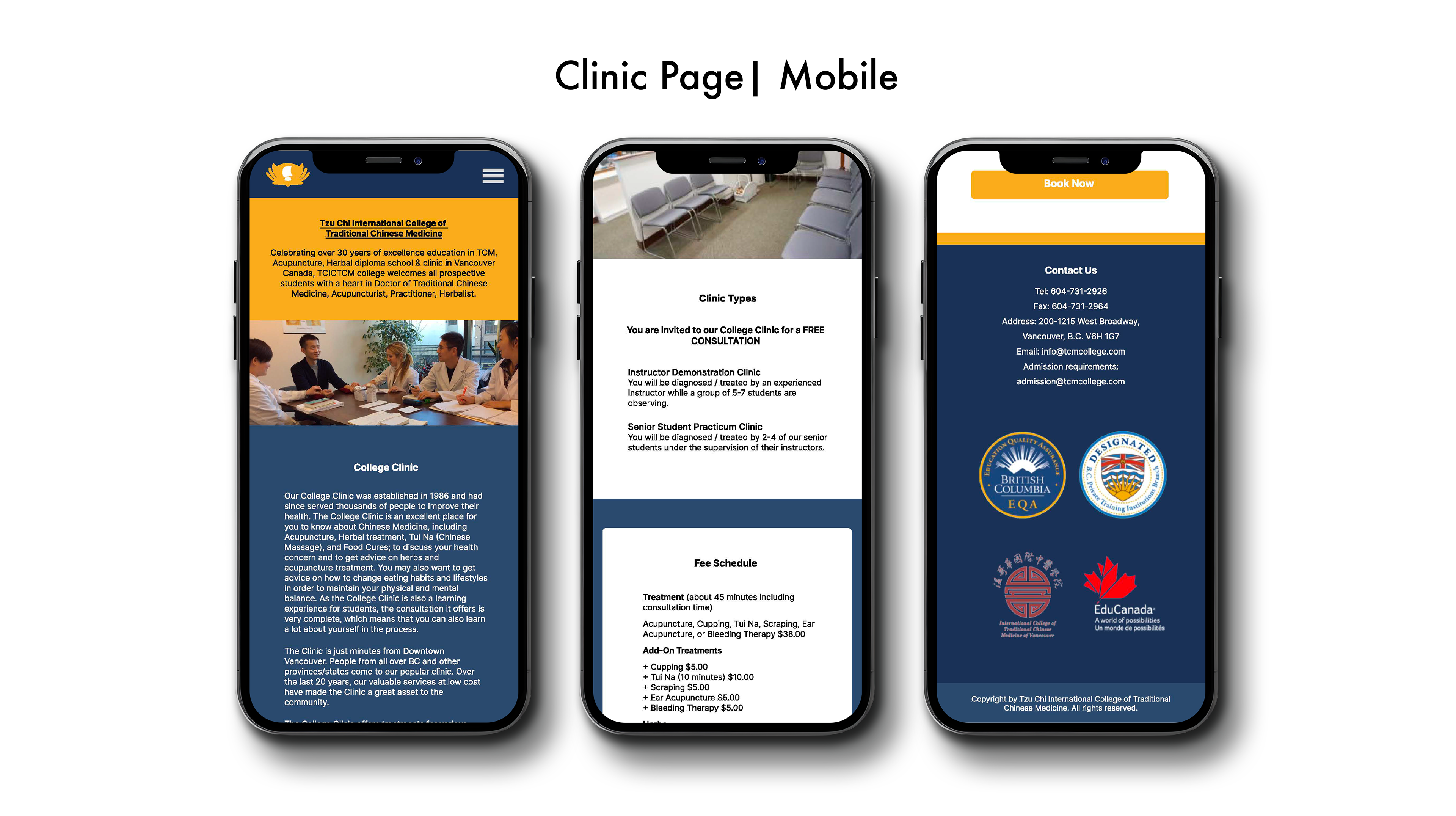
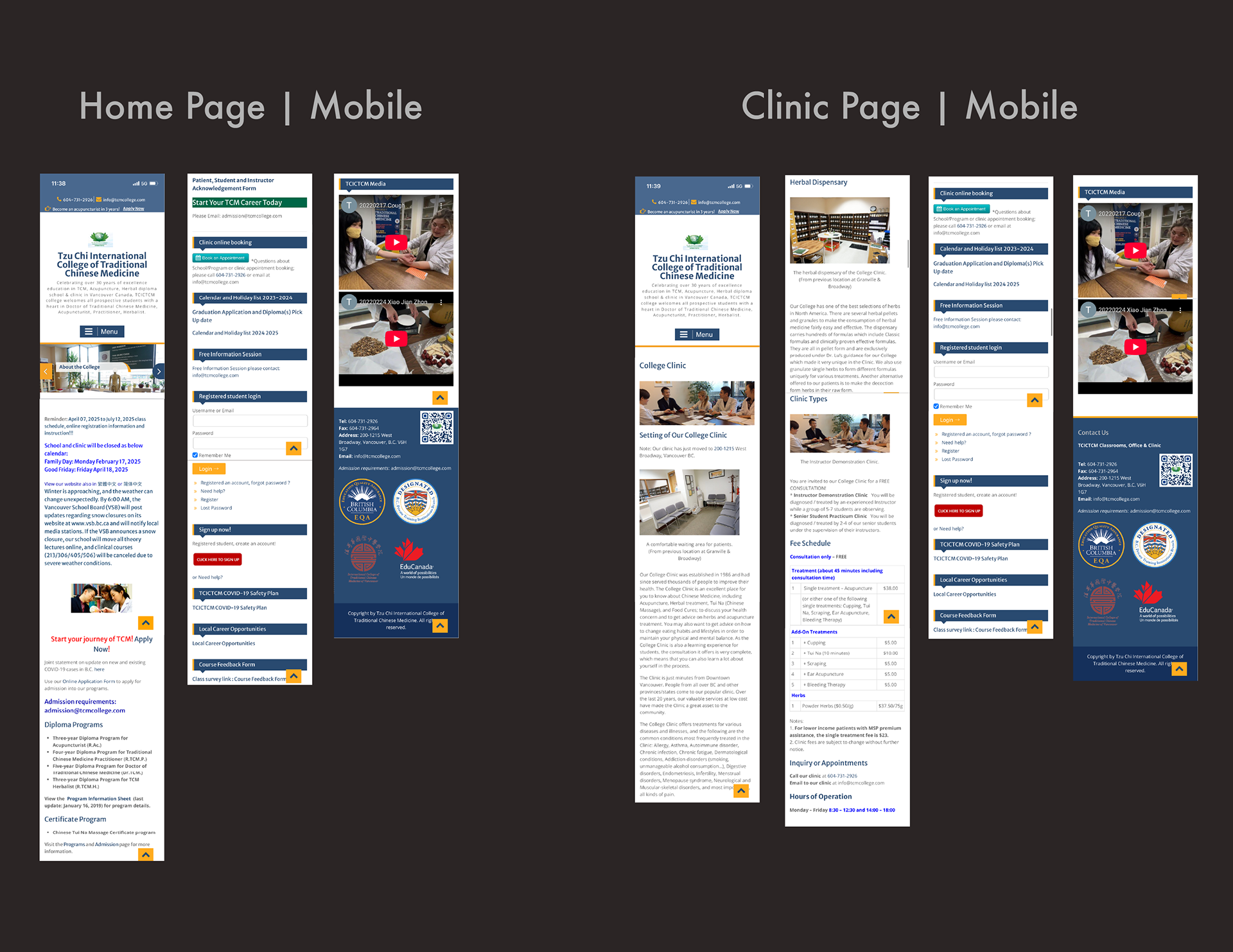
I began this project by capturing the issues I saw on the Tzu Chi website. The site was quite basic and lacked consistency in brand identity and UI. I wanted to standardize how a user scrolls through to find important information. I chose to redesign the "Home Page " and their "Clinic Page" and overhaul their menu bar. On the home page, you can see a prominent banner image and text describing the company and what they do. Some vital information is presented on the left side of the banner image.
Site Structure
As the user scrolls down the page, they will see simple yet consistent cards with either text or images. I chose the original website's colours and made them more prominent throughout the pages. There are two shades of navy blue (#31496C and #1F3154) used in the background and a golden yellow (#F0B042) used for buttons and other accents. I wanted to make sure the cards were consistent and easy to program. They have rounded edges to offer some movement and reduce the sharp feeling of the original site.
There was a lot of extra information on the right-side panel. I therefore wanted to incorporate it into the menu bar. There are now more menu options, which allows the user to reach this information quicker and with ease. I also chose to do a simple redesign of the Tzu Chi logo, as the original was an overly complex graphic in green lotus and did not fit the brand colours they had chosen on the site. It is now the brand's golden yellow lotus shape with its signature ship in the centre.
Conclusion
The images on the original website were of low quality, but I did not want to switch them out. I made them smaller and used them in some of the section cards. One image was of such low quality that I replaced it with a stock image of something similar in content and tone. Another challenge I found was in the name of the organization itself. The full name is "Tzu Chi International College of Traditional Chinese Medicine," and its acronym is TCICTCM. The length and complexity of the name were challenging to place at the top of each page simply for aesthetic layout reasons. I found a solution by creating a small yellow section highlighting the name and the organization's purpose.
Overall, I enjoyed working on this project and seeing the vast difference between the original website and my redesign. If I had more time and budget, I would visit the location in Vancouver in person and take more inviting and higher-quality photos to help present the space in a more appealing way. I would also work with the client to ensure their new logo is consistent with their brand and something they can use for the foreseeable future. I learned a lot developing this project and appreciated working on it.
If you would like to view my Figma file please click here.