
Summary
Formula Festival is a concept music festival set in Northeastern Germany. This project’s aim is to highlight my ability to develop and compose cohesive brand assets for an organization with a specific feeling. This is an individual project created at the end of 2024 in which I used a consistent mix of Adobe Illustrator, Photoshop and Figma.
The festival’s main genres are house and techno. Its target audience is international, queer adults aged 25-45 years old who are open minded, egalitarian, and are involved in the music scene where they live. As usual, I started the process with research. I studied where these music genres evolved and how that influenced where it they are today. I collected album art, event posters, and merchandise from the subculture to establish how I might want to approach colours and graphics.
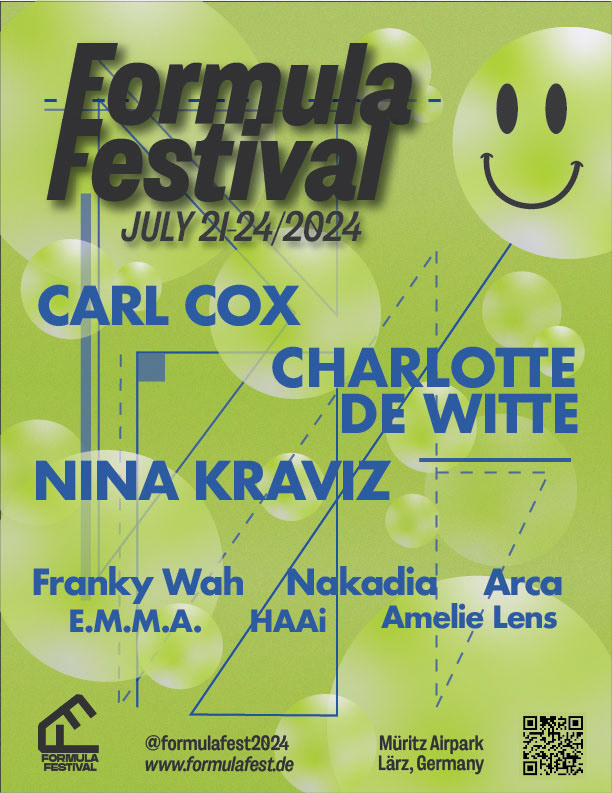
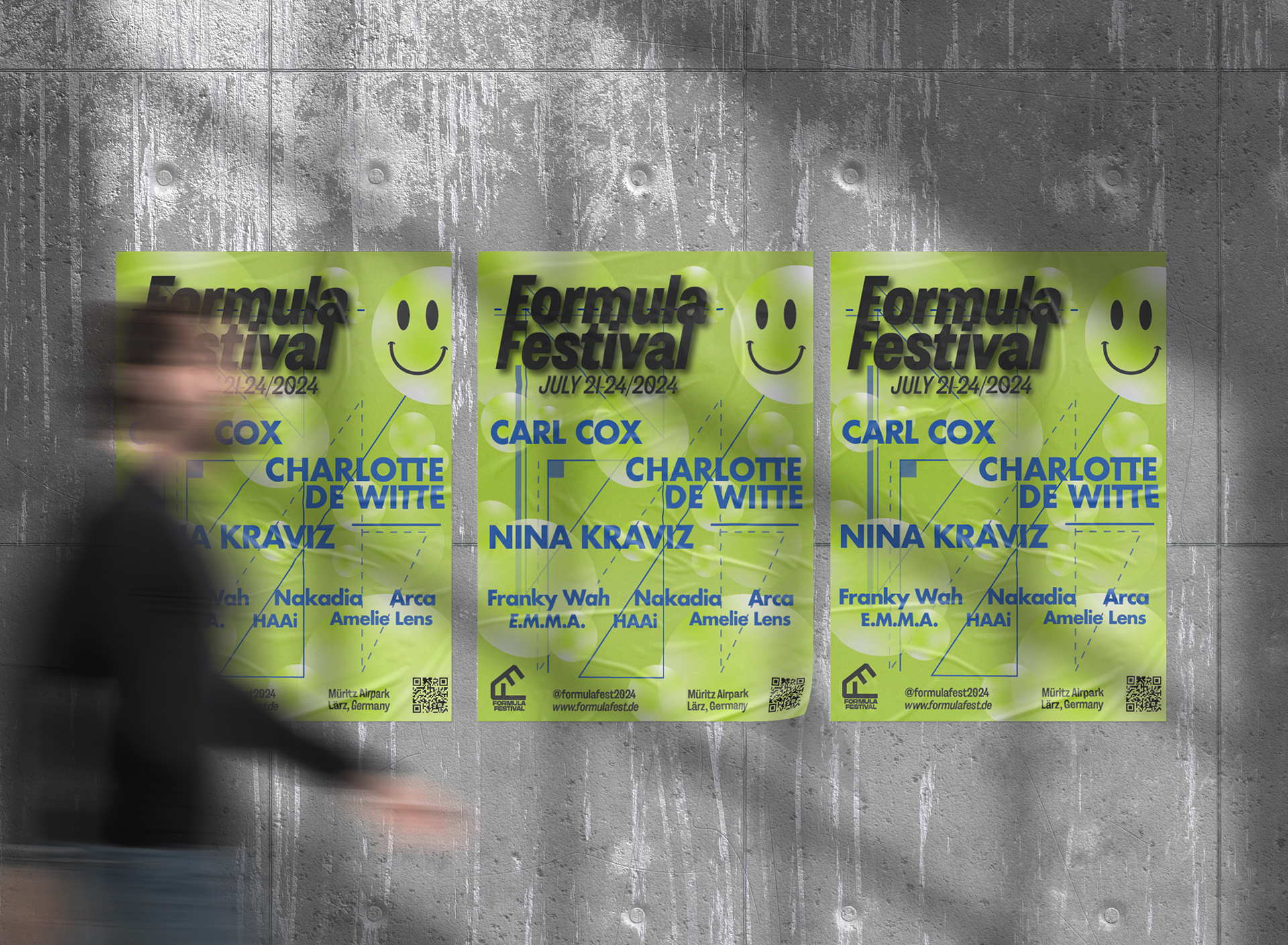
Poster
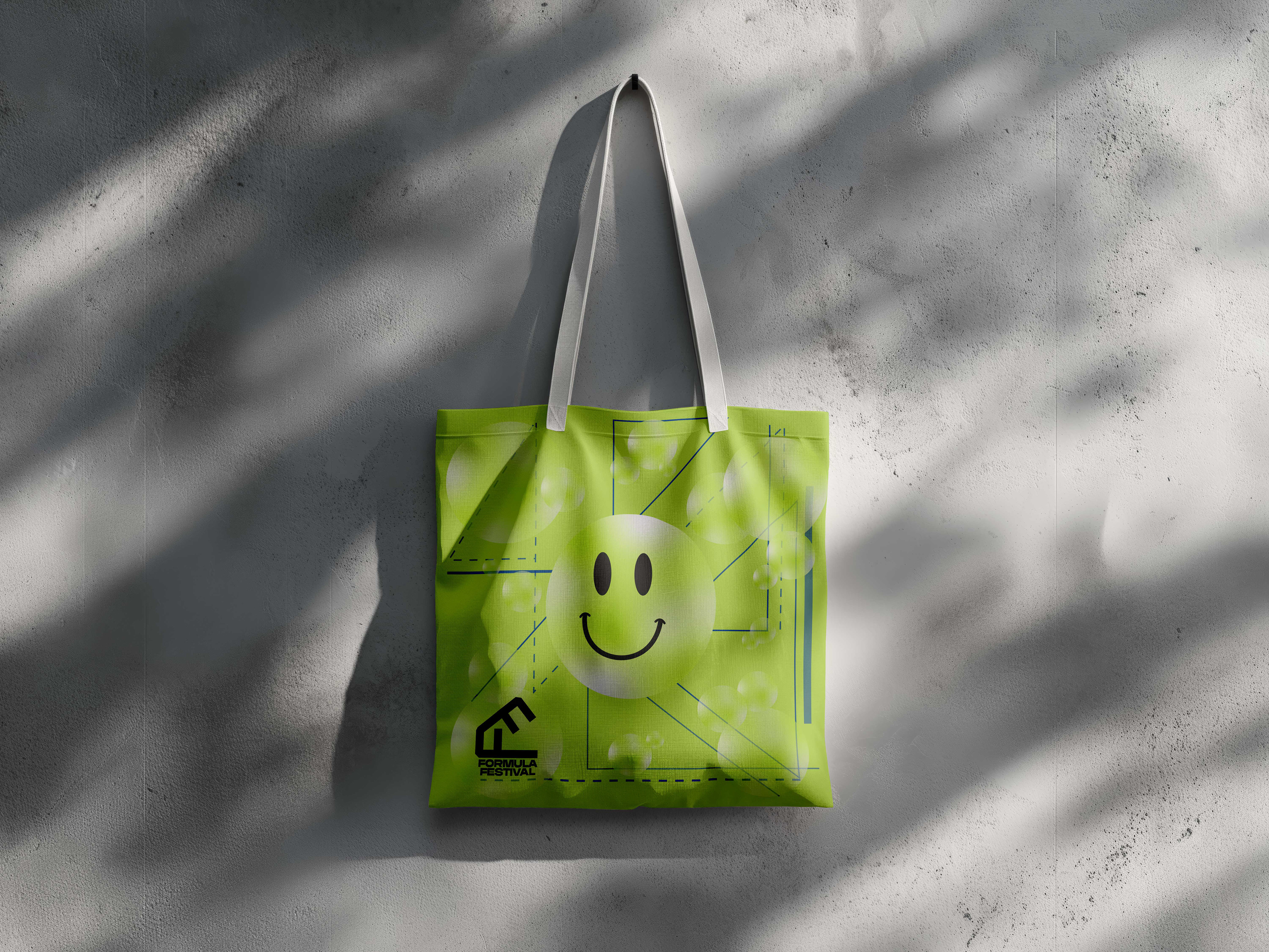
One of the main components of this project is the festival poster. After studying posters of other festivals and genre events, I settled on a geometric pattern, representing lasers that often appear at these events. The name of the festival, Formula, also offers a mathematical interpretation. The visual geometry seen in the poster plays with the music’s actual mathematical formula, being a steady and repetitive beat. Since house and techno music derive from disco, there is a lot of use of spherical shapes, used to represent disco balls. I chose to use bubbles to maintain an unseriousness in the theme and continued that motif throughout the other assets.
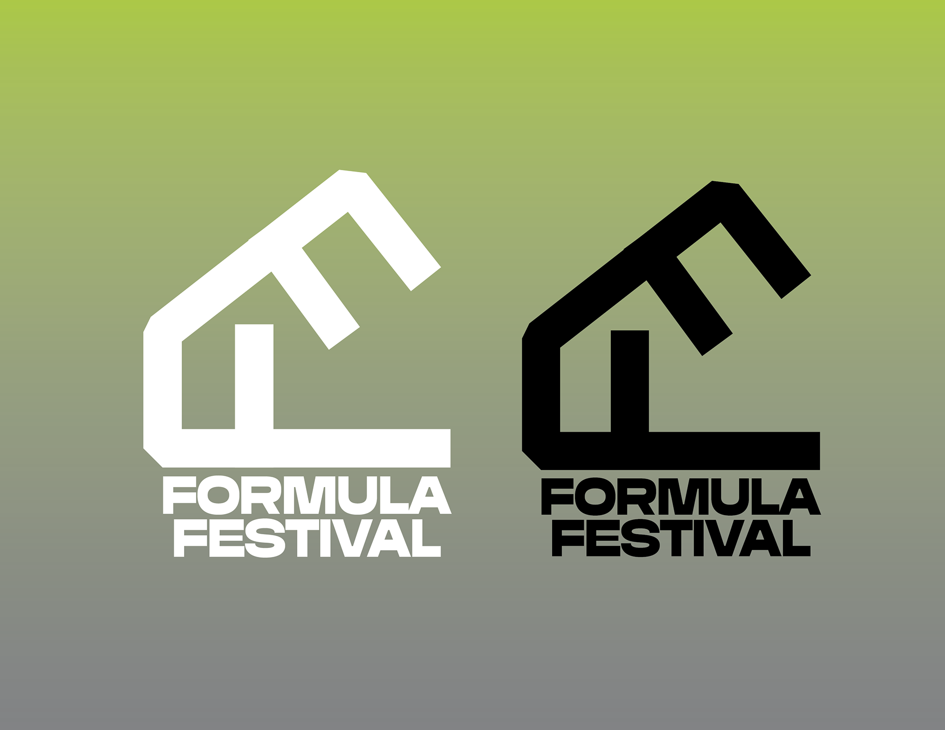
Logo Design
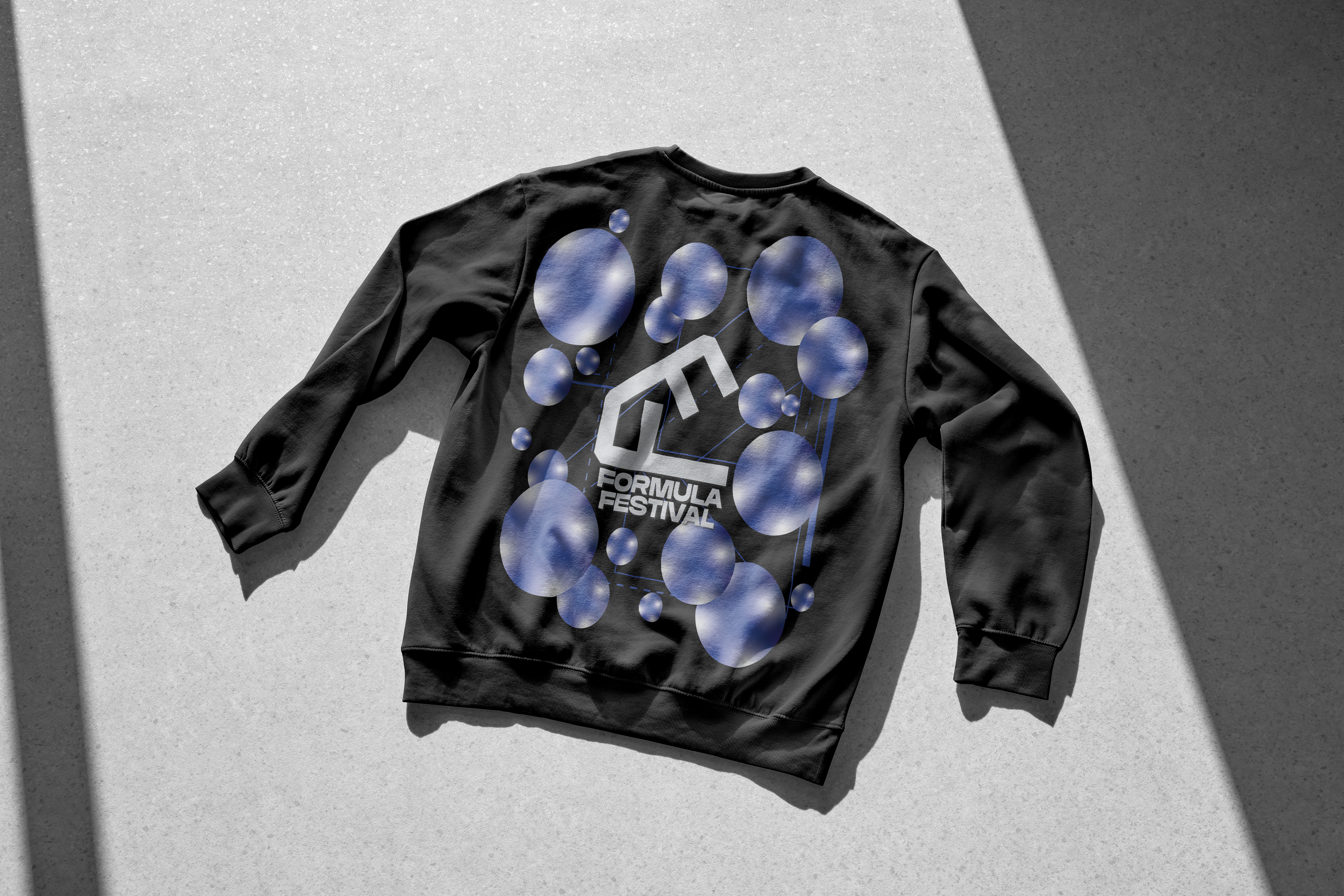
The Formula Festival logo was created by forming two letter F’s into a pitched roof “house” shape. Members of the subculture often refer to these events as going church and the logo’s overall shape teases with this reference. The arms of the Fs represent a DJ booth and lasers coming from the ceiling. I wanted to keep it mathematical and follow the golden ratio, which, without the festival text, it does. The logo can work in black and white or in any of the festival colours.
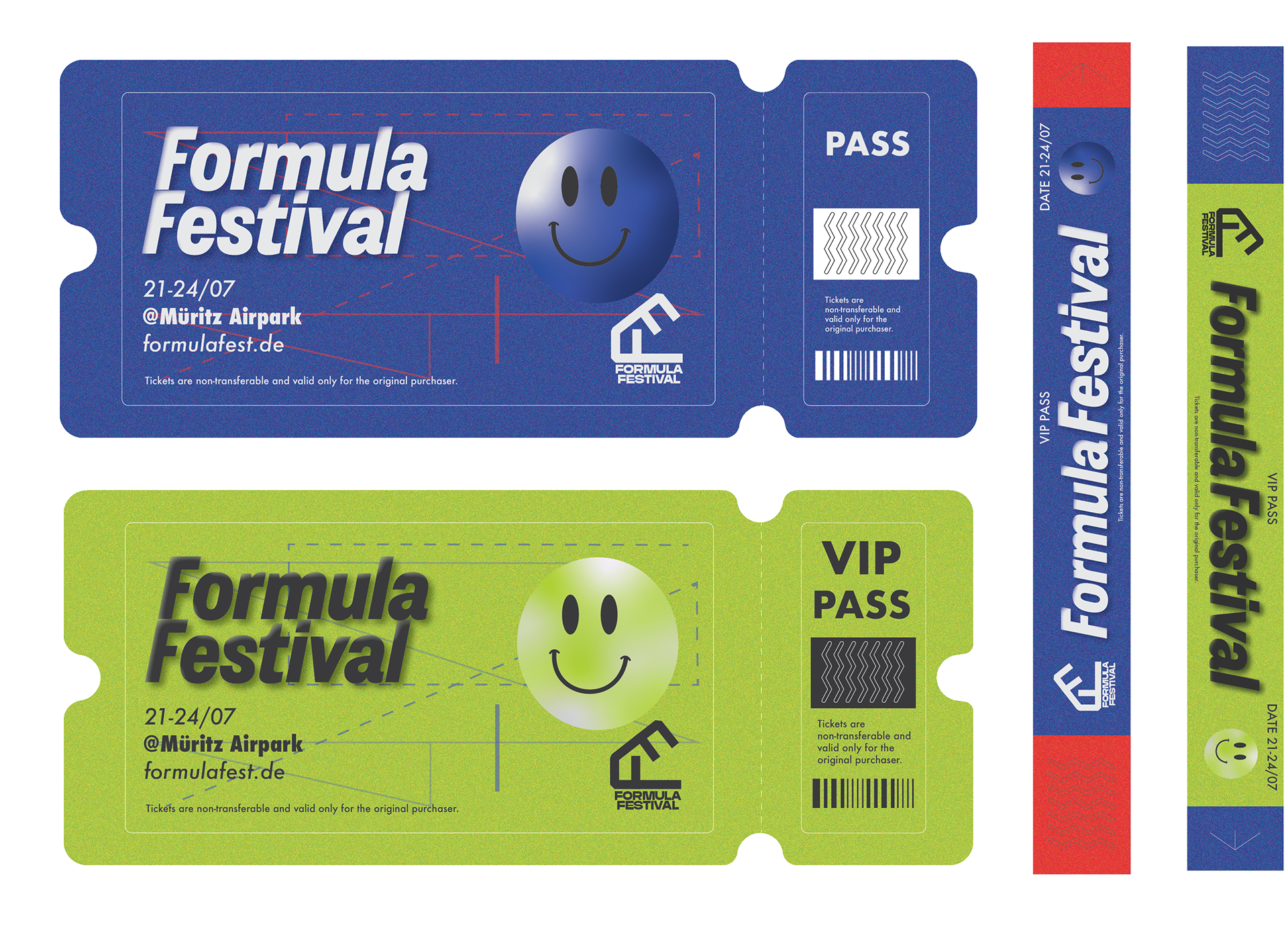
Tickets
Here I have the festival tickets mocked up as general event attendee and VIP. My primary colour is a toxic green (#ADD136) and I used a high contrast blue (#3851A3) and a bright red (#EE2C2A) as accent colours. The toxic green was chosen to represent the industrial aspects of the subculture. Often events are held in industrial warehouses that may have once been sites dealing with chemicals or other such materials.
Research and Conclusion
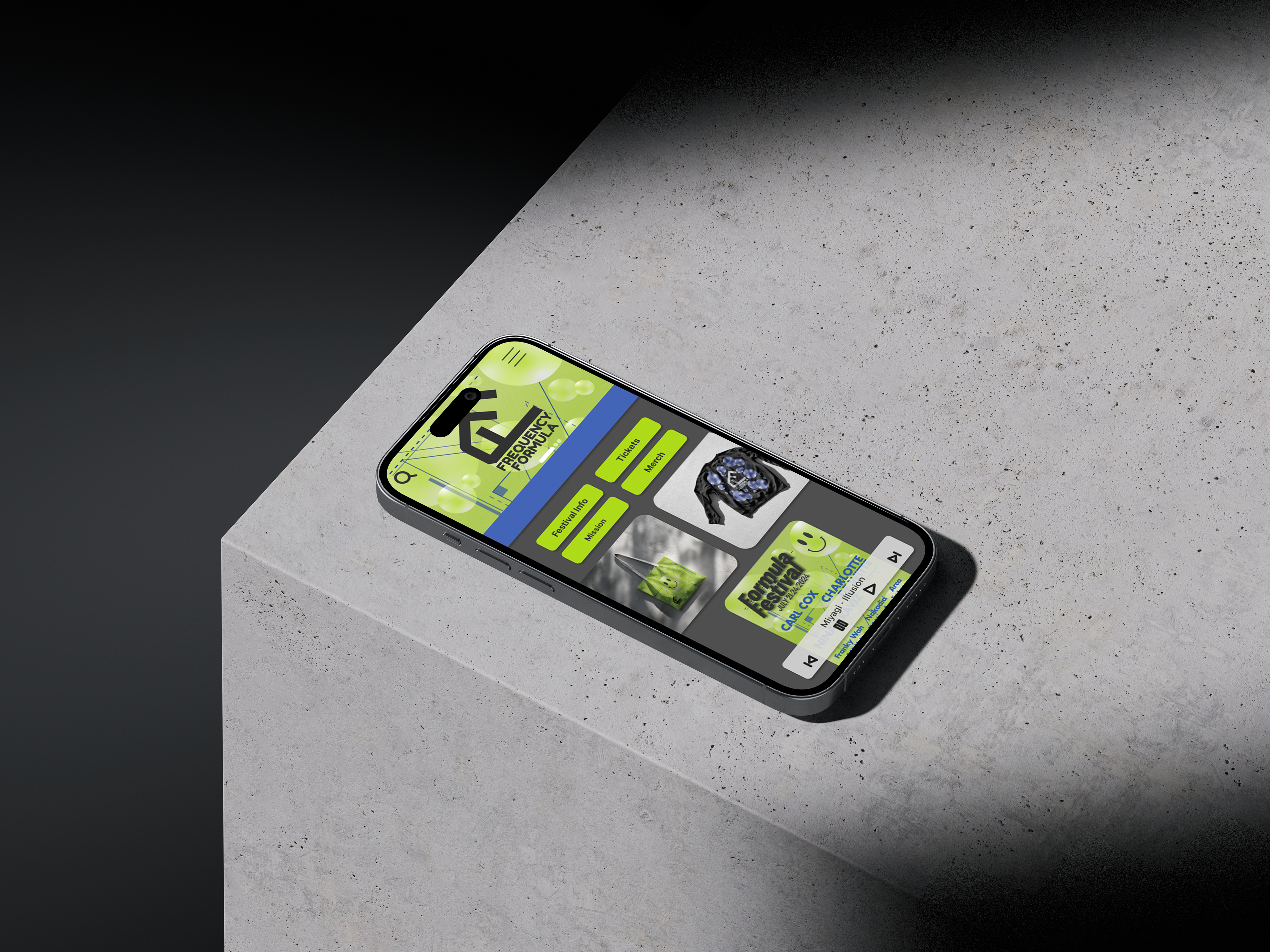
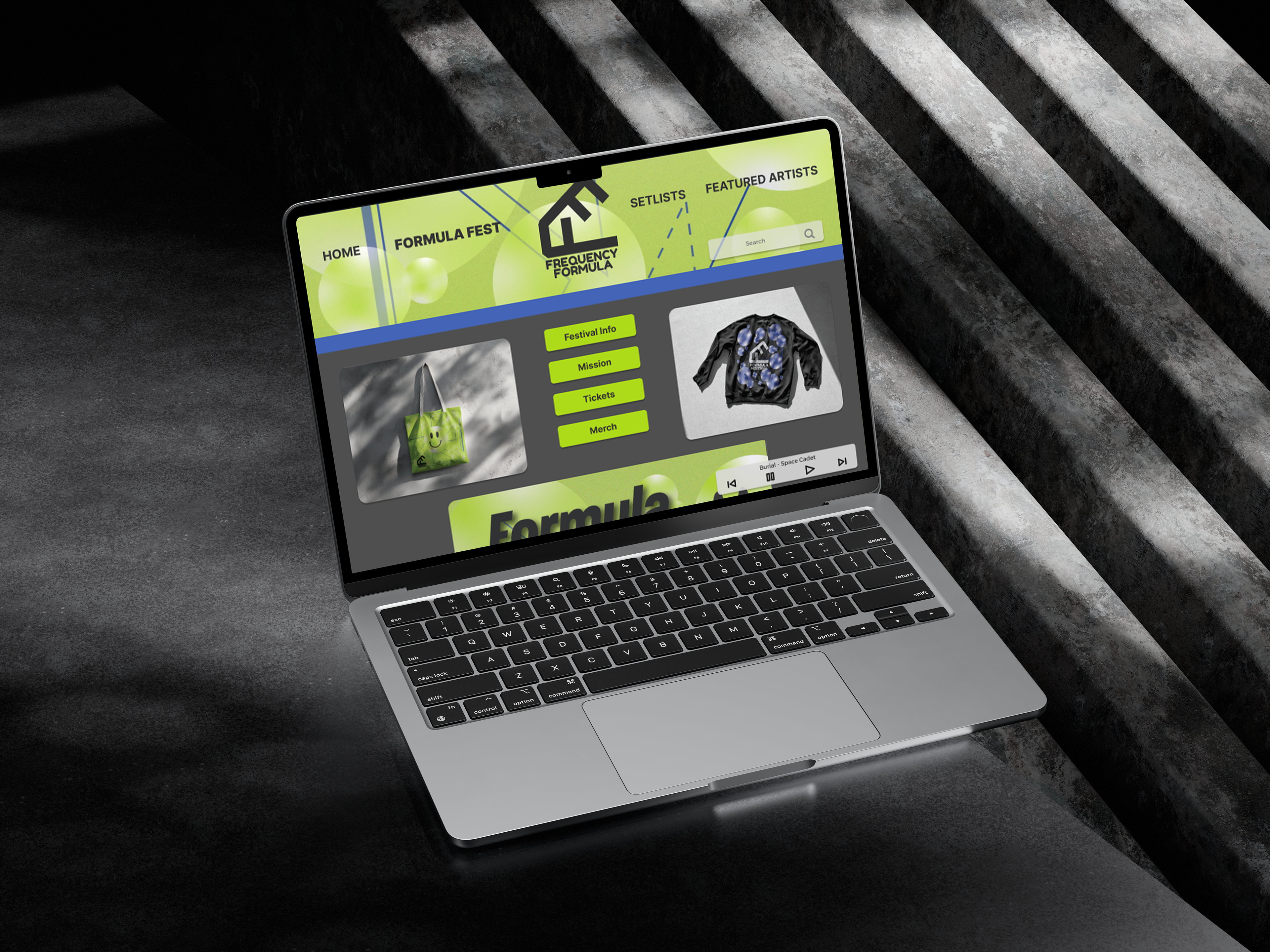
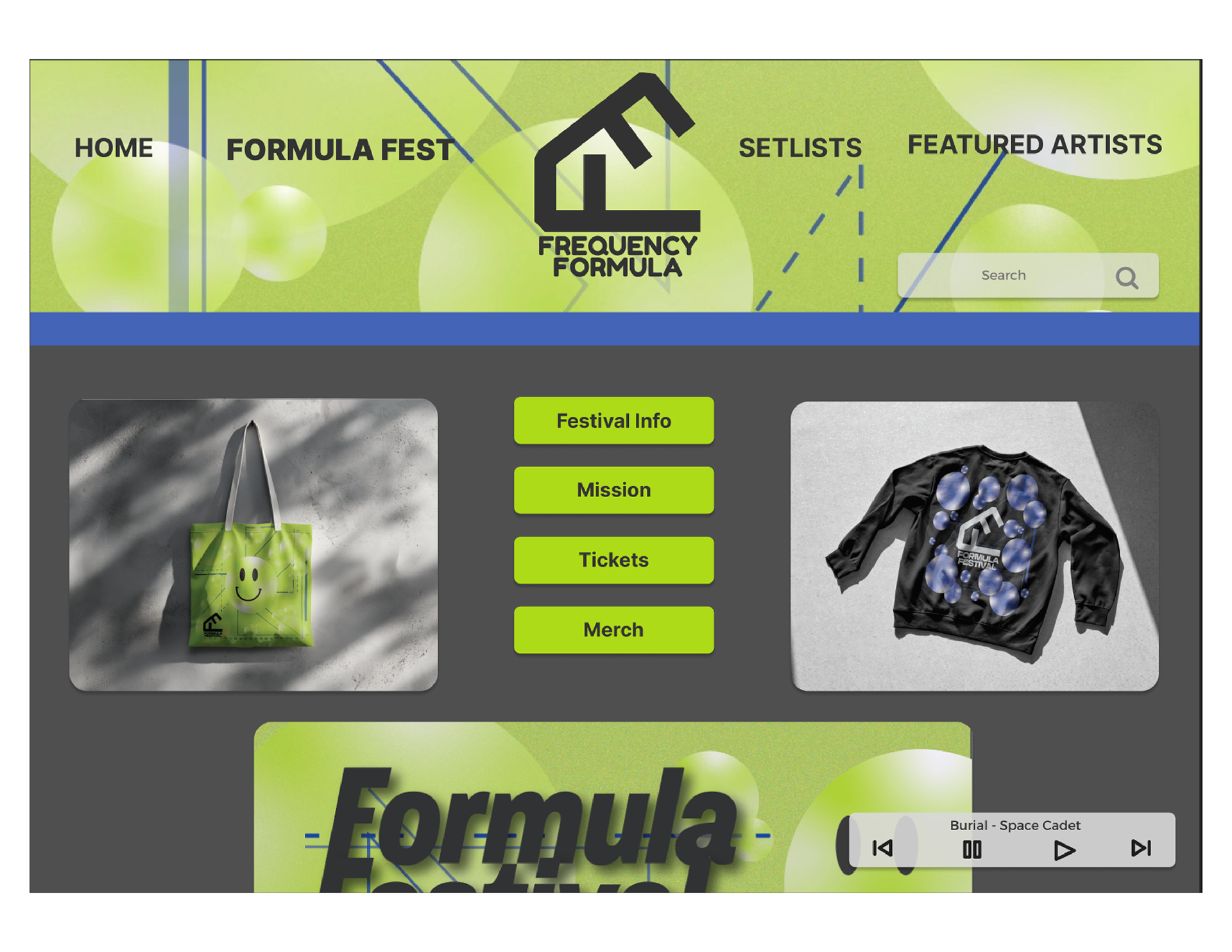
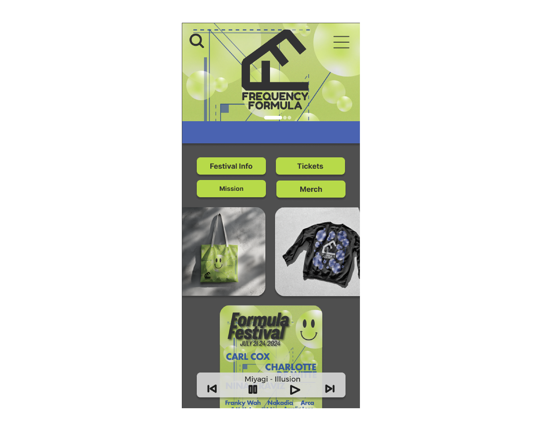
Through my research I noticed that many of the target audience wears a lot of black, accented with vibrant accessories. I chose to focus on a black sweater and tote bag for the merchandise. I wanted appeal to the festival goers so they would actually use and cherish the merchandise bought there. I have also included a simple and straightforward web and mobile site layout to show how it might be marketed online.
I had a lot of fun with this project. It was challenging to come up with a concept with such a free range of possibilities. After eventually settling on colours and the general theme of the festival, I was able to narrow down how I wanted to organize the layouts and assets. Had I more time I would have gone further with merchandising and continued to develop the logo and theme a bit more. Overall this project was a great exercise in restraint as well as creative freedom.