Summary
Mellon is a community building application concept where users can host and attend events in their immediate neighbourhood. The idea is that individuals, families, or groups of neighbours can host small-scale interest-based events in their nearby area in order to foster community where they live. This was a group project aimed at showcasing a user experience and interface that fits well with the application’s purpose and goals. It was made primarily using Figma with supplemental help from Adobe Illustrator and Photoshop.
Concept & Typeface
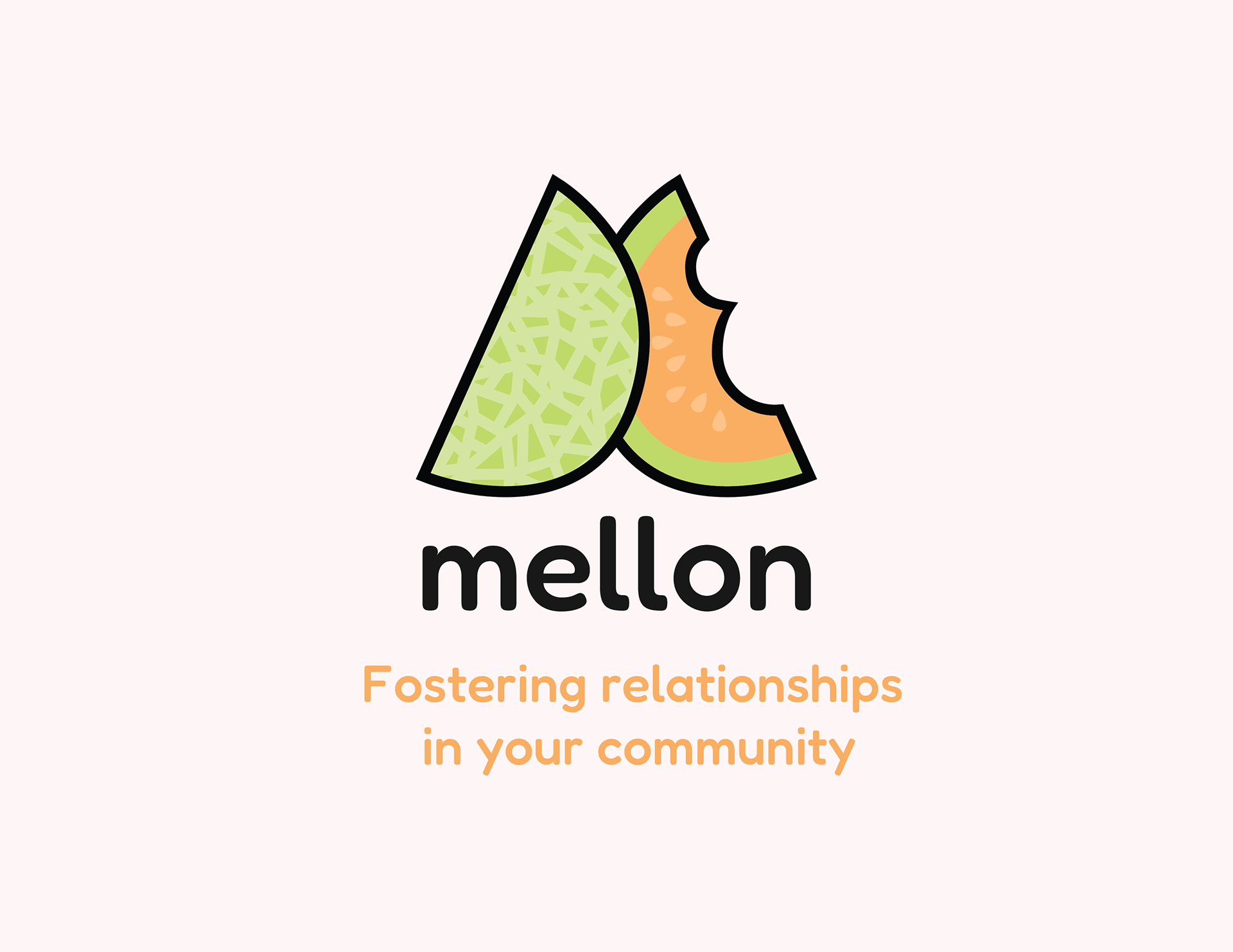
The name “Mellon” comes from the Elvish word for “Friend” in the Lord of the Rings. We liked the sound of the name and went with a friendly melon colour theme and bubbly font (Fredoka) that feels easy and approachable. The logo is a simple cantaloupe-like melon in an M shape. The slice of melon represents one slice of a greater community that makes up a whole.
UX Flowchart
As a group, we brainstormed the application concept and agreed that our main question should be “How might we promote community building in Vancouver?”. I played a significant role in the creation and collection of survey data from a number of people living in Vancouver and the Lower Mainland of BC. Through these surveys we discovered how members of the public met their current community and how they would approach meeting members of their neighbourhood. There seemed to be a disconnect between a lack of desire to build community (due to life constraints) and their outlook on community being a highly positive thing. We had 56 respondents and the majority thought an app with the intention of creating events-based community would be helpful to their neighbourhood.
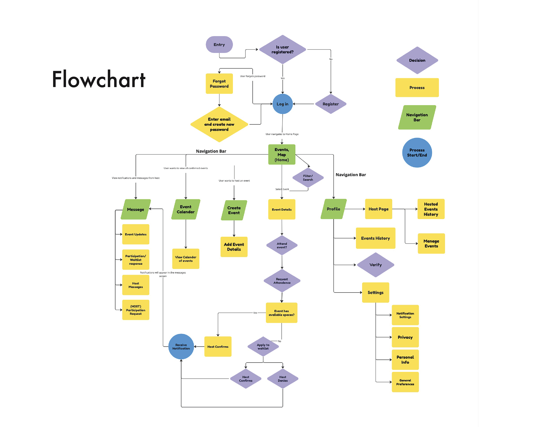
As a next step, our team discussed many ways in which the UX might flow. We approached user continuity by building a flowchart. This helped us visualize how the app could be organized and what features we needed to focus on. We took inspiration from other applications and settled on having a locked navigation bar at the bottom of the screen, where users could reach the main functions quickly and smoothly. Our main functions would be messages, event calendar, create an event, events home, and profile.
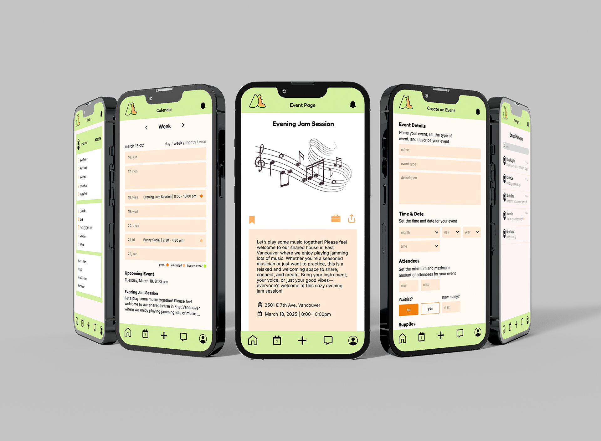
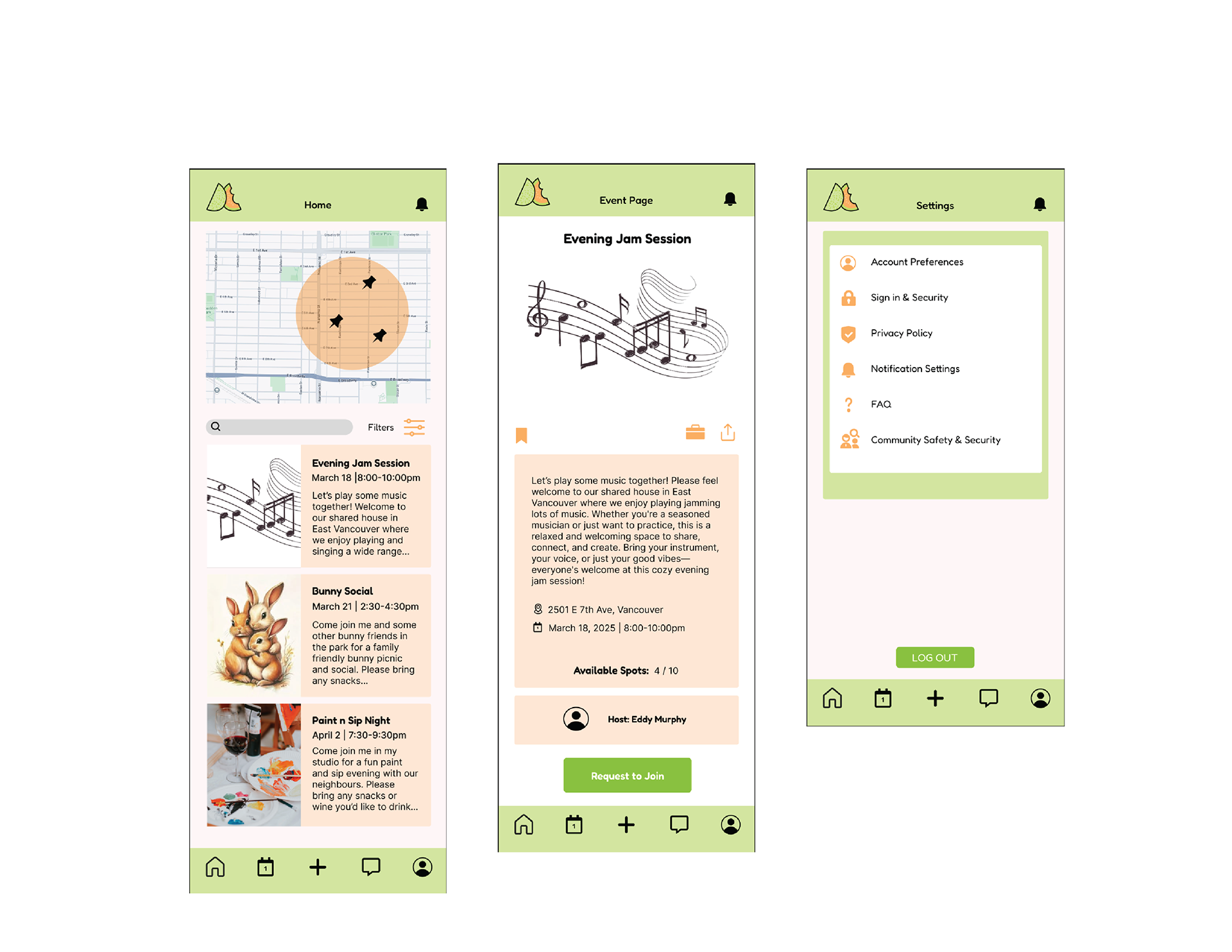
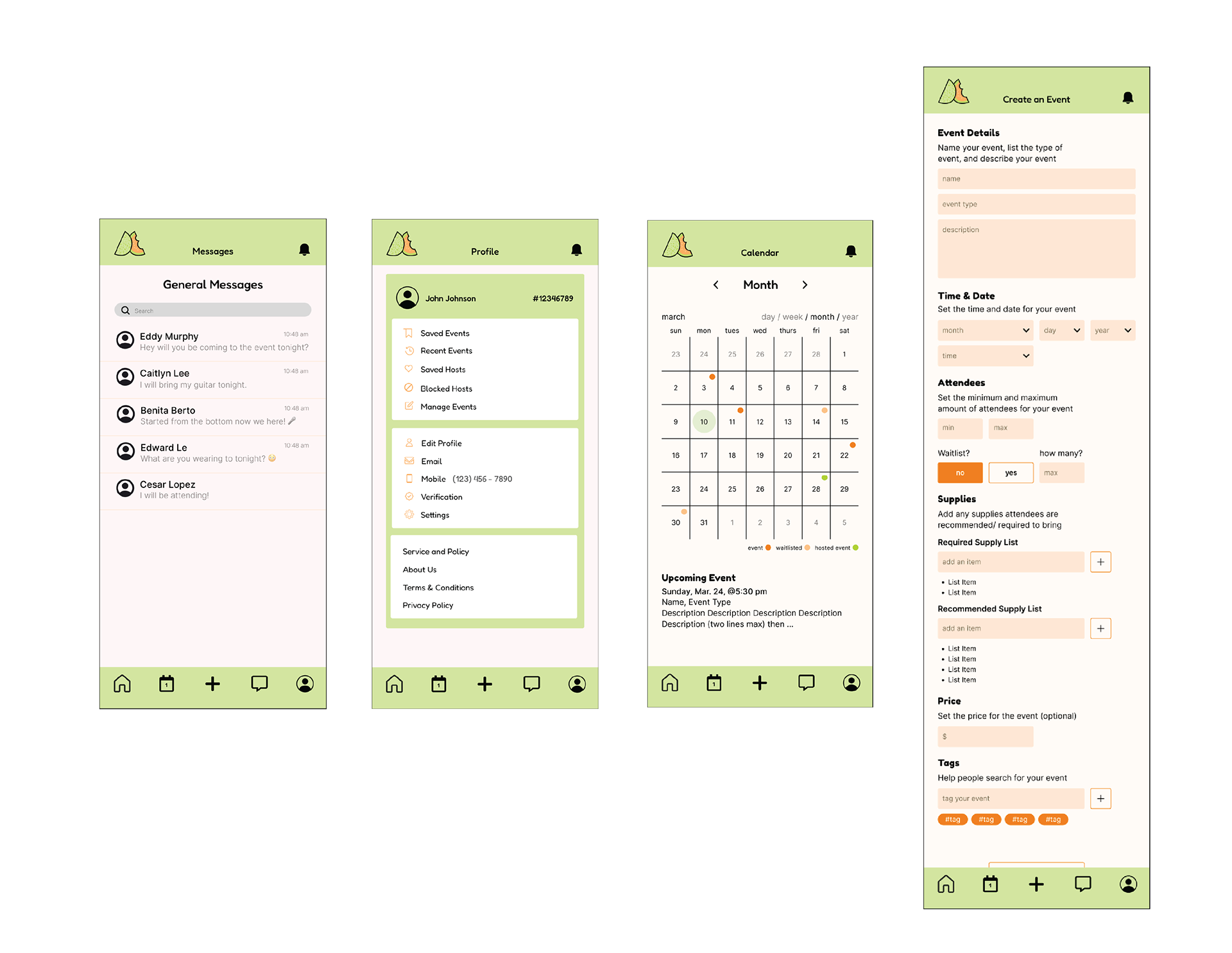
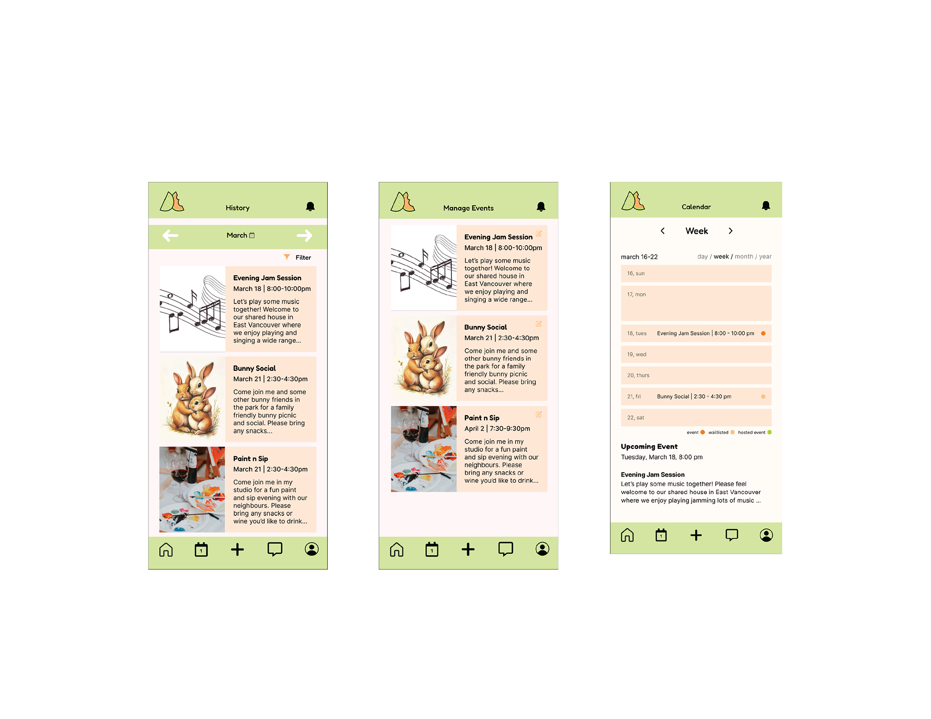
Application Pages
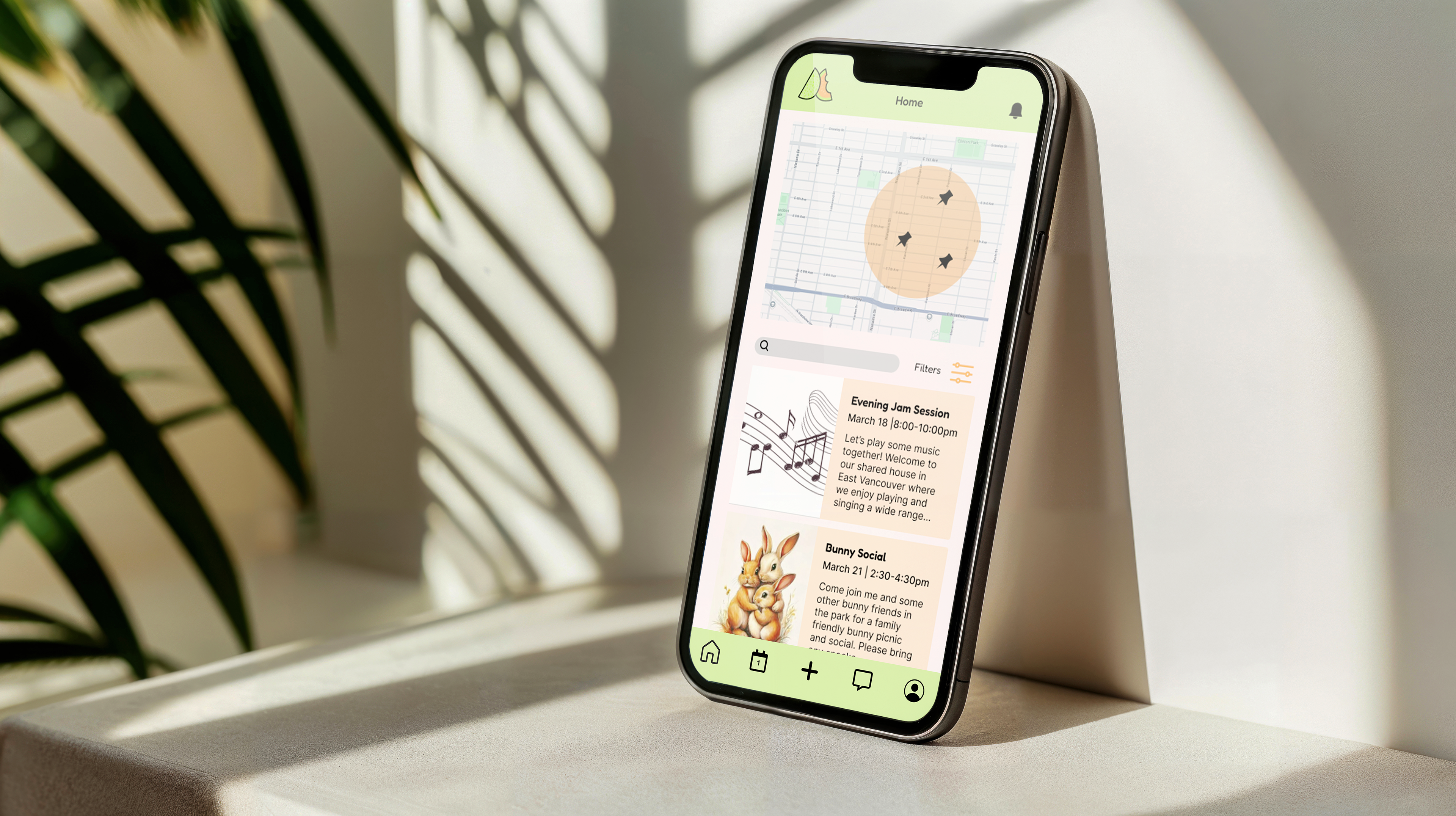
After building our style guide, complete with application cards, fonts, icons, and colours, for the mobile interface, we created wireframes and set out to design flat art UI. Each of the group members each made 3 pages in the application. I was responsible for the Home Page, Event Page, and Settings. I wanted the cards to be simple to program but also have enough information on each event to get the user interested. The map was taken from Google Maps and would have a standard map search function to see events in the user’s vicinity. It should be intuitive enough for the user to know to push the cards or text box to learn more about each item.
Conclusion
As with any group project, there were difficulties in agreeing upon every design decision. The four of us had different ideas and perspectives which caused for some challenging but fruitful discussion and helped each of us really cement our reasoning for each decision. It was not a completely smooth process; however, I believe the confrontations we pushed through were indispensable in terms of learning how to work with others for a common goal.
I learned a lot through this experience and enjoyed working with this team. I believe working on this application concept has helped me learn what to prioritize from the beginning of the creative process to its end. Due to time constraints, we were not able to conduct as much research as I believe could have been useful to the project. If given more time, I think we could have pushed to further develop the logo and refine some details in the UI. Overall however, I am satisfied with the work we have presented here.