Summary
I was approached by the founders at Nusakan to create a logo, brand identity, business cards, and website that best fit their innovative engineering company. Nusakan researches and develops high tech remotely operated systems for the Canadian defence industry. They are a highly skilled team that work hard innovate durable, reliable, and cost-effective machines. I aimed to create a logo and brand identity that expresses these core values.
Process
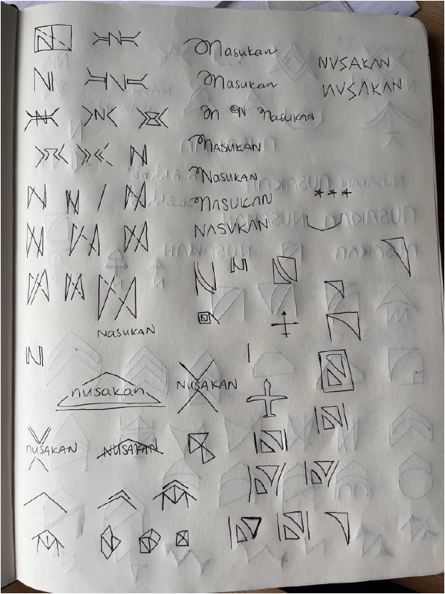
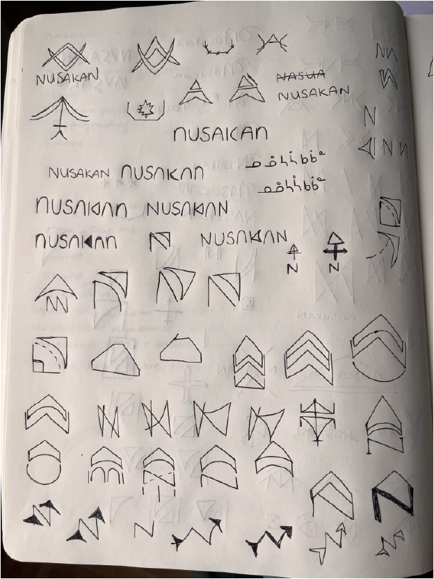
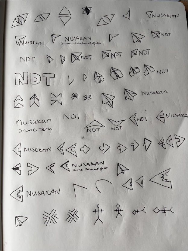
After researching major competitors in the industry, I began sketching. Many logos in the unmanned autonomous vehicles industry use triangles as main shapes. Like rockets and planes, triangles offer an aerodynamic and stable shape. Here are a few of the sketches I started with and which became the base of the final logo. I began drafting up three options I thought were best representative of the brand and presented them to the client.
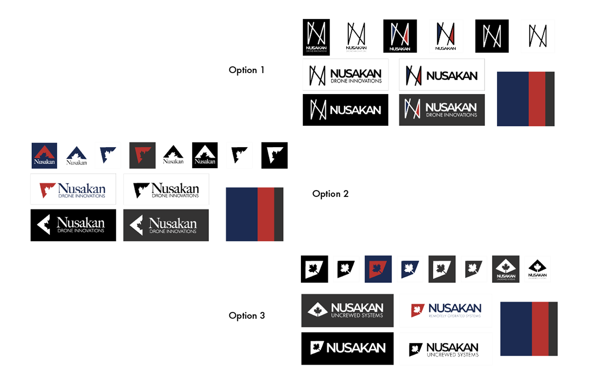
I presented the three logo options above, which take shapes from the UAV and space industry and blend them with Nusakan's desire to be seen as competent and reliable with adversarial design. The first option has 4 parallel lines, hinting at its Arabic meaning, going in a north-south and northeast-southwest direction. This shows versatility in the drone camera’s navigational capabilities. I kept sharp angles to indicate precision and accuracy. In context, these angles offer a sense of security to the audience.Option 2 takes a more serious approach. Nusakan's main clients would be government entities, so I wanted to present them as a competent, trustworthy, innovative company. I used a triangle drone shape, much like others in the industry but I put it on an upward left or northwestern angle, indicating where the company is from and based out of. I’ve used the Canadian maple leaf shape at the centre of the drone, thereby carving out the wings. My intention with this negative space is to see it as a puzzle piece, where a Canadian drone solution fits perfectly into a problem gap elsewhere.
The third option presented is a variation of the second, which offers a clearer UAV shape. I used two connected triangles alluding to two points merging, a problem and a solution. The Canadian maple leaf is placed at the centre of the object, emphasizing its importance in the Canadian UAV industry and presenting clearly to a government client. I kept the angles mostly sharp other than a slight curve at the wings, as I wanted to keep showing strength and certainty in the technology’s wayfinding vision.
Colours
I chose a few brand colours that I thought could represent Nusakan well. Because Nusakan's main client will likely be the Canadian government I wanted to use strong, dependable colours. The main competition in this industry uses a lot of black so I wanted them to be able to stand out and present themselves as a Canadian company and brand.
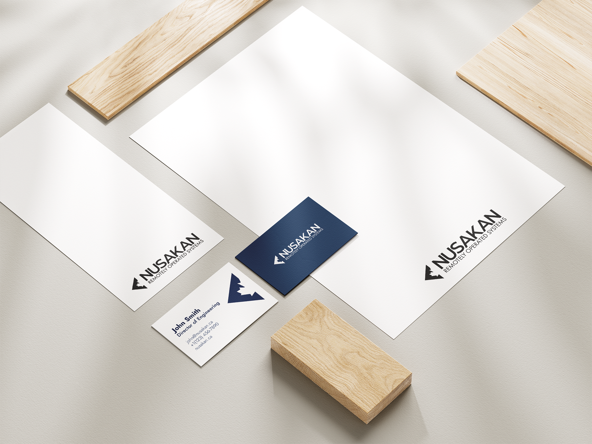
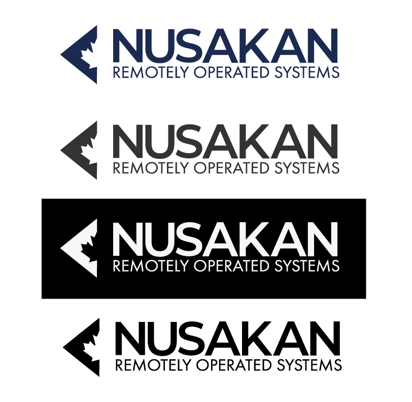
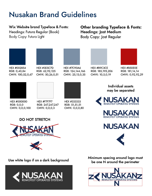
Above is the final logo and full lockup we ended up going with. It is clean and crisp and shows competence without being overly domineering. It was delivered with these colours and the option to have a red triangle leaf with navy text; however, the client chose not to use that colour combination. Each logo is delivered as full lockup, icon, and wordmark in PNG, PDF, and SVG formats. I also included simple brand guidelines to help the client use the logo in an effective and clear way, while maintaining its brand identity. This logo has now been used throughout the Nusakan website, on business cards, conference brochures, and other print materials.
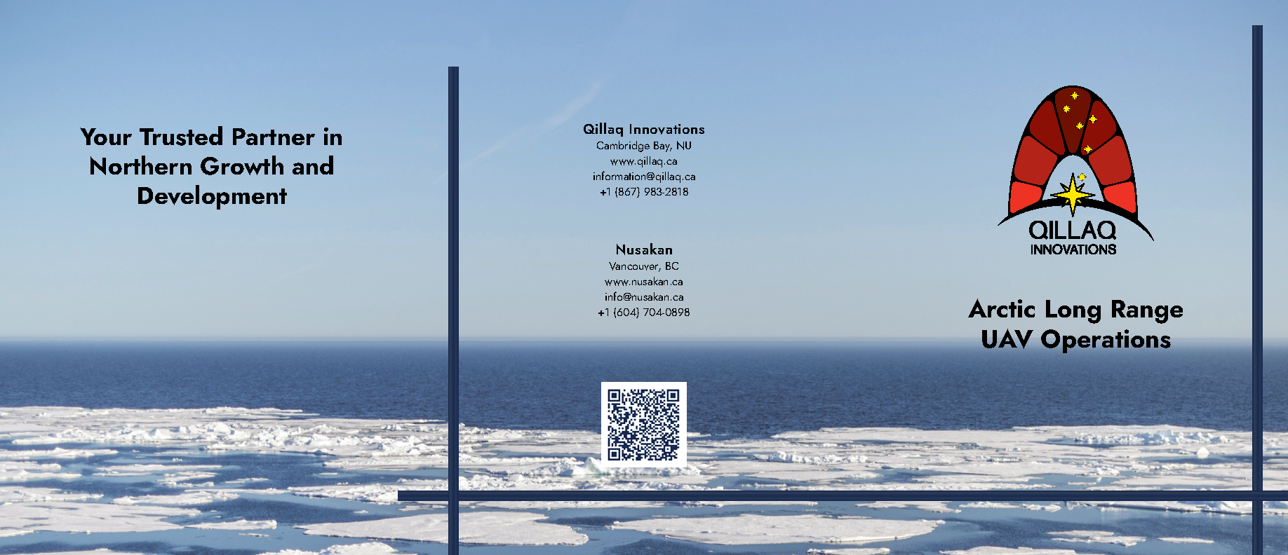
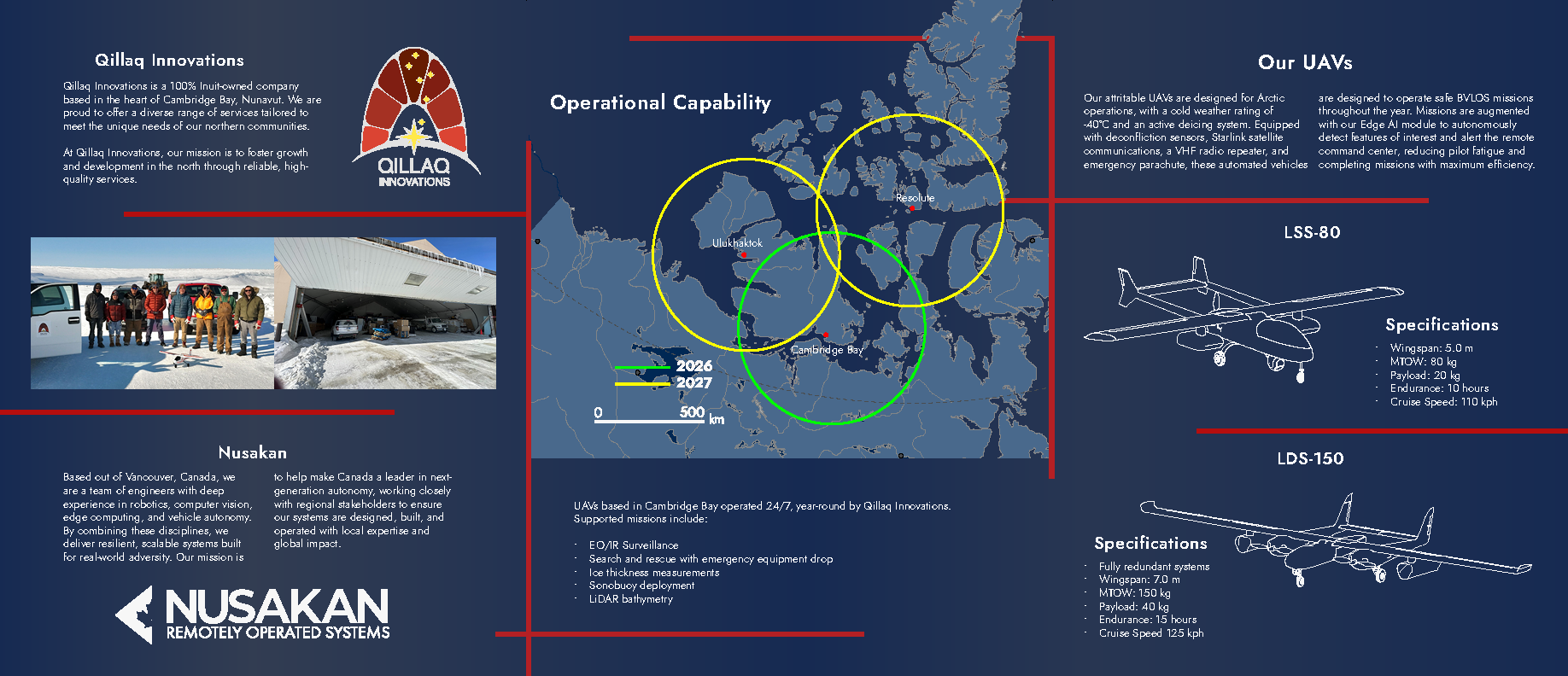
Conference Brochure
In September 2025, Nusakan attended the DefSec conference along with their client, Qillaq Innovations. I was asked to create an 8.5 x 11in printed tri-fold brochure maintaining the Nusakan brand identity along with information about Qillaq. This brochure took public Nusakan information as well as projected support missions in the arctic. I created the Operational Capability map from a Government of Canada map of the arctic and replaced its colours with Nusakan branding. I worked with the printer to make sure the colours would appear as vibrant and clear as expected and to establish the best print materials for a professional conference setting. The printed documents were clean and clear and were distributed to over 50 potential clients at the conference.
Web and Mobile Site
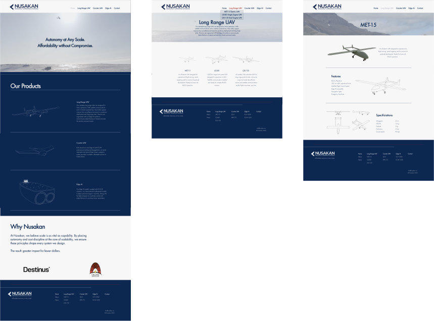
After the major branding decisions had been made, I was asked to design and build the Nusakan website. Because I only had one month to complete this project, I decided to go with Wix website builder so I could jump right into the process. I started by establishing colours, typefaces and layout structures for each page. The home page features a short, looping video reel of Nusakan product development and their UAVs in action. As you scroll through the homepage, you will see information about the company, and wireframes of their main products, and some of their clients.
Nusakan wanted to feature its key products in a clean, consistent and professional manner. They have three main categories within which each of their products fit. I took a simple approach and listed each of those categories in the main header with subheadings for each individual product. Each category has its own page where products are featured and are linked to their own respective pages. There is also a contact page where inquiries are sent directly to the client's email address.
Finally, Nusakan wanted to link some of their social media posts into a blog, which can be found under the News subheading. Here, I created a page where any company updates can be posted and shared on LinkedIn or other media sites. Each post has an image representative of the article, while maintaining a consistent format throughout.
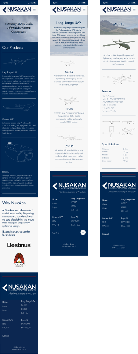
The site is responsive and can be viewed from all devices. I have included mobile and
Click here if you'd like to see the full website in action!